I've been busy helping to take care of my six week old son, and I've had a hard drive crash. I also try to paint from time to time. I am still working on the series on color mixing, and I'm trying to recover a long post I had almost ready on the subject.
I'd like to note that I've had more than 2,000 visits since I started the blog at the end of June. That's not much for sites like boing boing, which probably has more hits than that in a typical hour, but it seems pretty good for a personal site that restricts itself to a fairly obscure topic. Thanks for stopping by, and please feel free to leave comments.
I'll try to get back into the swing of things this week.
30 September 2006
29 September 2006
Bottle of oil and blue glass

Awhile ago I posted on a little sheet of copper I had prepared for painting on. Here's what's on it now. Oil on copper, 5 x 7". It's not done yet—I need to correct a couple of elipses and clarify some of the details. But so far I like it.
The copper takes oil paint like nothing else I've worked on. Normally, any surface is either absorbent or slick. Either way, the initial application of oil paint can be a bit of struggle. Not copper. The paint flows right off the brush, with no streakiness, chattering, staining, or other problems. Also, you can incorporate the tone of the copper itself into the painting. I need to find a source for bigger sheets of thin copper to paint on.
24 September 2006
Renaissance layering
When you walk down a museum hall full of Renaissance paintings, you can easily pick out the Italian paintings from the Netherlandish paintings at a glance. While the subject matter is similar (mostly scenes from the New Testament), and the pigments are basically the same, they used color in completely different ways. I've come to realize that the difference largely comes down to how layering was done.
By layering, I mean variations on glazing. I am using that term broadly to mean any application of two or more layers in which the layers beneath contribute to the final visual effect. Glazing can be done with relatively transparent colors such as red lake, or with opaque colors such as vermillion (if it is applied thinly enough). In both the Netherlandish and Italian traditions, glazing was critical to the final appearance of important parts of almost all paintings, but the way they used glazing was different.
In Netherlandish painting, glazing was used to adjust values with minimal loss of chroma. Typically, an opaque color, such as vermillion, was applied first. The initial layer was typically flat—i.e., with no attempt to model the forms. Then a transparent pigment of similar hue, such as red lake, was applied over the initial flat layer. The transparent color was applied thinly in light areas and thickly in dark areas. Often multiple layers were applied to darks. Because thicker layers of transparent pigments absorb more light than thin layers, a thick layer is darker than a thin layer. This approach to modeling, in which darks are created not with darker colors, but with thicker, light-absorbing layers, creates an optical effect that is completely different than simply mixing a light, a midtone, a dark, and then blending them. Blacks and other dark, dull colors were avoided in Netherlandish glazing. Fully-modeled objects have a jewel-like tonality that jumps off the picture. This glazing technique wasn't used throughout the painting, but was carefully applied in order to control the structure of the composition. It was not used in modeling flesh tones, which were typically done very thinly, in one or two layers.
In Italian painting, by contrast, glazing is used to generate hues through optical mixing of layers. For example, in early Renaissance Italian tempera painting, flesh tones are created by first applying a layer of dull green, then modeling in a dark dull brownish green. On top of that, the flesh color is created by applying an opaque pink (flake white mixed with vermillion) thinly enough that the underpainting shows through. Later in the Renaissance, when Netherlandish oil paintings began to be imported, the Italians tried to copy those effects in oil paint. But while they knew how to make oil paint, they didn't know about Netherlandish layering. They created darks by mixing dark dull colors, including black. Italian oil paintings from that period show none of the chroma intensity in the darks that make Netherlandish paintings so special. It wasn't that they were stupid; it was that they thought about color and layering in a different way, and that approach created a different set of effects. The Italian method was also useful. Botticelli, for example, underpainted foliage with black before glazing over with greens. This makes the foliage fade into the background. He underpainted flesh with yellow ochre, to make flesh tones that had a warm cast. Michelangelo used a traditional (and then somewhat old-fashioned) underpainting with greeen earths for flesh tones. If he wanted two different tones of blue drapery in a painting, he would underpaint one with black, then ultramarine mixed with varying amounts of white and black. The other would be done in the same set of ultramarine gradations over white gesso, creating two completely different ranges of blue with the same surface pigment. Leonardo's sfumato method involved a very dark underpainting in dull earth tones, followed by glazing with light colors mixed with a lot of white. Italian painting is generally brighter and more chromatic than Netherlandish painting, but the darks are more dull. The eye picks up on these differences very easily.
It's useful to understand how both of these kinds of layering effects are accomplished, because if you know how to do both, you have a broad range of useful tricks.
23 September 2006

20 September 2006
How to get oil paint to dry quickly
The joy and the curse of oil paint is how long it takes to dry. It's great to have lots of time to work with the paint, re-do mistakes, and get those gradients and edges just right. But then, in multi-layered painting, there are times where you just need to stop and let the paint dry. For days. It can be very disruptive to artistic momentum.
Some painters are fine with letting paintings dry for days or even weeks. They work on more than one piece at a time and come back to each one when it's ready. But sometimes you want stay with one piece, working every day. Here are some ways to control the rate at which oil paintings dry:
1. Paint in thin layers (like the thickness of a normal coat of house paint).
2. Avoid slow-drying pigments like titanium white and ivory black. Use fast-drying pigments like lead white and burnt umber.
3. Avoid paints made with slow-drying oils like safflower and poppy. Also avoid walnut oil, which dries faster than safflower or poppy, but slower than linseed.
4. Use a lean lead-containing medium such as Maroger's.
5. Add a bit of turps to the first layer. Turps doesn't make paint dry faster, but it makes the paint layer thinner, which does make paint dry faster. Don't add so much turps to paint that it becomes washy or watery. Just add a little bit.
6. Paint on a panel primed with glue-chalk gesso. The first layer will have some oil absorbed by the gesso, so the paint dries more quickly.
7. Add small amounts of metallic driers to the paint. I prefer lead napthenate. I add one tiny drop (from a toothpick) per blob of paint on the palette and mix thoroughly. Excessive use of driers will damage the paint film, but that much should not be any problem. I generally add driers only to slow-drying pigments.
Some painters also use alkyd mediums such as Liquin, Neo-Meglip, and Galkyd. I don't use alkyd mediums and I don't recommend them. However, they do make oil paint dry faster.
When I need to, I can get oil paint dry in a day, so I don't usually have to wait for a layer to dry before I can paint over it. Sometimes, I choose to use a medium that makes the paint dry more slowly, or I use a slow-drying pigment like titanium white. But when I do that, I know that the paint will need extra time to dry. My glazing medium (a 50/50 mixture of black oil and Venice turpentine) is somewhat slow-drying, so glazes usually take two or three days to dry.
It's also the case that I often complete one section of a painting at a time. That way, it doesn't matter whether yesterday's paint is dry, because today I'm working on a different part of the picture.
16 September 2006
Online workshop: Renaissance Italian painting
I'm doing an online workshop over at the Wetcanvas forum on Renaissance Italian painting materials and methods. You can follow along here.
14 September 2006
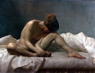
Jacob Collins
is one of the great modern realist painters. He's a student of Ted Seth Jacobs, who also taught Dennis Cheaney, who I've studied with. What I particularly like about Jacob is his facility in finding exactly the right combinations of light and color to create a mood. The work is finely-rendered without being fussy. It is informed by the work of the past, but is still clearly from the early 21st century. In his best work he creates a kind of visual hyper-reality, in a manner similar to, but different from, the work of Andrew Wyeth.
You can see his work at his web site. There's some other good stuff at the Art Renewal Center.
I hope he doesn't mind my posting a sample of his work:
You can see his work at his web site. There's some other good stuff at the Art Renewal Center.
I hope he doesn't mind my posting a sample of his work:

Pigments, paints, and color mixing wheels
This is the third in a series of posts about color for painters. In the first, I established (to my satisfaction, anyway) that the usual advice on color that you see in most books on painting, based on a three primary color wheel, is not very useful. In the second, I described the Munsell color system, which provides a useful approach to describing color, although it doesn't say a lot about how to mix pigments together.
I know that you've all been waiting with great anticipation for this next post in the series, in which I reveal a simple and comprehensive method that allows you to easily mix exactly the color you want with just a few inexpensive tubes of paint. Alas, I must now confess to you that—so far as I know—such a system doesn't exist. What I can do is to describe some of the issues involved in the complex subject of color mixing and then present several ways to approach the problem.
First, let’s talk a little about paint and pigments. Pigments are colored powders. Some of them are rocks and dirt that have been ground up and purified, some are simple chemical compounds, some are created via complex modern organic chemistry, and some are tiny water-soluble particles that are made suitable for painting by attaching them to larger uncolored particles. Each pigment has a characteristic color (hue, chroma, value) which is the result of the pigment particles absorbing some wavelengths of light and reflecting others. Changing the particle size often changes the color, sometimes radically. Heating many pigments will change the color—burnt sienna is just a cooked version of raw sienna. Changing the medium in which the particle is suspended often changes the color due to a different refraction index—ultramarine blue is much darker in oil paint than in egg tempera. Some pigments come from a single pigment company and in that case all paint makers start with the same raw material. Other pigments are available from multiple suppliers and each may provide a version that is subtly, or not so subtly, different—there are many, many variations on cadmium red. The color of most pigments is different when they are laid on thick (this is called the masstone) and when they are laid on in a thin layer (this is called the undertone). Pigments are usually described as “opaque,” “semi-transparent,” or “transparent.” That refers to how well light passes through the pigment when it is mixed into a transparent binding vehicle. Transparent pigments are much darker and lower in chroma when they are thickly applied than when they are thinly applied. Pthalo blue is a very bright color when spread thinly, but a dark, almost black, blue when it is very thick. Opaque colors are more likely to have a masstone and undertone that are basically the same, although there are exceptions. Transparency varies somewhat from one painting medium to another, because it is a function of the refractive indexes of the pigment and the binding vehicle. With water media, the refractive index of the vehicle changes as it dries, so what looks transparent when you lay it on may be fairly opaque when the paint dries.
Almost no pigments are manufactured for artist’s use; they are made for large-scale industrial purposes, such as signs, cars, house paint, printing, cosmetics, and all of the other industries that use these materials in far greater quantities than artists do. Paint manufacturers buy these pigments and grind them with a binding vehicle and other components to make paint. (In some cases, individual painters may purchase powdered pigments and make their own paint.) A tube of paint may contain only one pigment or several; if adulterating pigments are present in small amounts, it may be considered legitimate not to note that on the packaging. Many paints are mixtures of pigments to make a certain color not obtainable with just one pigment—many companies sell a paint mixture they call “flesh,” for example (usually this means some sort of pinkish attempt at caucasian skin tones). Some companies sell mixtures that are designed to mimic an expensive pigment. So a paint called “cadmium red hue” won’t contain any of the expensive cadmium red pigment, but instead will have a combination of other pigments designed to have similar color characteristics.
So, given these issues, it’s impossible to just develop a simple model of color mixing; every artist uses different pigments, in different media, made differently by each company (and, perhaps, formulated differently from one batch to another). And every artist applies paint differently.
Even if you could correct for all of these factors, there are other challenges. Let’s look at one attempt to produce a color mixing system for artists: the Quiller wheel. Stephen Quiller, a working artist (mostly in watercolor and acrylic) has designed a color wheel to assist artists in figuring out how to mix color. A large number of common colors are placed in various positions around the wheel. Where the color is placed depends on (1) the color’s hue and chroma; and (2) the color’s mixing complement (which is directly across on the other side of the wheel). Color placements are a matter of Mr. Quller’s judgment and extensive mixing experience, not any sort of mechanical measurement. Lower chroma colors are closer to the center of the wheel, while higher chroma colors are closer to the outside. So if you are using the Quiller wheel, and you want to mix a particular color, you would find the location on the wheel of the color you want to mix, then mentally draw a straight line between two actual colors. In theory, any color on that line can be mixed with those two colors. You can therefore find a mixture that is the one you want.
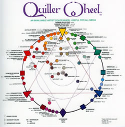
A color mixing wheel such as this will often get you into the right ball park when mixing colors. Unfortunately, it has some problems. First, there are the issues of paint variability discussed above. One cadmium red light is not necessarily the same as another. Second, there is the problem of hue shifts. Because of the physical properties of pigment, when two colors of paint are mixed in different proportions, the hue doesn’t always follow a straight line that can be plotted on a wheel. The hue instead follows a curved path that is not predictable just from knowing the colors of the two paints being mixed. This curved path might mean that the color you want cannot be mixed from the two colors you’ve selected, even though it looks like that should be possible from looking at the color wheel. Another problem with a mixing color wheel is this: paints can have multiple mixing compliments. A complimentary mixing pair, you will recall, is two paints that, in some ratio, can be mixed to form a grey color with 0 chroma (or very, very close to 0). A mixing color wheel attempts to place complimentary pairs directly opposite each other on the wheel. But because in real life a pigment may have more than one mixing compliment, its actual location on the wheel is an arbitrary choice. Since the wheel is trying to do two things that are not always compatible (show the appropriate location for mixing and show complimentary pairs), it represents a compromise. It's a set of guesses designed to help the artist get close to what he or she is looking for. It’s not a scientific instrument; it’s a compendium of rules of thumb, and those rules of thumb are often wrong. Another problem is that the wheel shows purples and yellows at opposite sides of the wheel, indicating that they are complimentary mixing pairs. But the reality is that most yellows and most purples don't have a mixing compliment, so the wheel deceives you when you try to mix those colors together.
There’s another problem with mixing wheels. They help you get into the right ballpark with the hue you are looking for. They can also give you an idea of what chroma any given mixture will be, since you should be able to find the approximate chroma of a mixture by finding where it lies on a line between two mixing pairs; the closer to the center of the circle, the lower the chroma. But what if you mix the perfect hue, and it’s the right color. How do you get the value you want? If you want a darker color, mixing with black will reduce the chroma drastically and will often shift the hue. If you want a lighter color, mixing with white will also reduce the chroma and will often shift the hue as well. So you may have the perfect mixture, except for value, and still not know how to get the final color you want. The color mixing wheel doesn’t get you to the finish line.
That all being said, the Quiller wheel (or something like it) is a useful tool that can be helpful, especially for beginners, in figuring out the basics of color mixing. There are other mixing wheels out there, sometimes with fancy sliders that you can turn around a cardboard wheel. There is also color mixing software that attempts to do the same thing. They all have significant limitations when it comes to making subtle mixtures of actual paints.
So what’s a poor painter to do?
Well, since many real-world painters manage to get good results with color, it is obviously possible to do so. In the next post, I’ll discuss several strategies for color mixing.
13 September 2006

11 September 2006
Politics
On the fifth anniversary of the terrible 9/11 attacks, I'd like to simply remember those innocents who died on that awful day.
Since this is a web log, I'd also like to note that I have strong opinions about politics, international relations, history, economics, the nature of freedom, the proper role of government, and other such matters. And I'm not going to say anything about those topics on this site. Please feel free to imagine, if it matters to you, that my beliefs and yours are remarkably similar.
Since this is a web log, I'd also like to note that I have strong opinions about politics, international relations, history, economics, the nature of freedom, the proper role of government, and other such matters. And I'm not going to say anything about those topics on this site. Please feel free to imagine, if it matters to you, that my beliefs and yours are remarkably similar.
08 September 2006
Technorati Profile
I'm having trouble getting Technorati to register that I still post to this blog. According to them, I haven't posted here in weeks. The link above is my attempt to correct this by deleting this web log from their list, then re-register it. The process includes posting the link above. It doesn't seem to have worked. I've followed the instructions on how to do this, and they used to register my posts. Then they just stopped. Anyone have a suggestion?
I'm having trouble getting Technorati to register that I still post to this blog. According to them, I haven't posted here in weeks. The link above is my attempt to correct this by deleting this web log from their list, then re-register it. The process includes posting the link above. It doesn't seem to have worked. I've followed the instructions on how to do this, and they used to register my posts. Then they just stopped. Anyone have a suggestion?
07 September 2006
More on color
In my last post about color, I discussed the inadequacies of the standard color wheel and explained why we're going to have to replace it with two things: (1) a more accurate way to describe color; and (2) a system for approximating real-world paint mixing. In this post, I'll talk about describing color. As I do so, I'll refer you to certain sections of the Handprint web site (from which I have stolen shamelessly) in case you want more detail.
Although we often still see the standard three-primary color wheel in books about painting and color mixing, it really went out of date in the late 19th century, when guys like Ogden Rood demonstrated that it pretty much stinks for describing color accurately. There is nothing in the way humans perceive light to support the idea of three unmixable primary colors (red, yellow, blue), each of which is complimentary to a specific mixable secondary color (red and green, yellow and violet, blue and orange). In fact, it makes sense to me that there are no special primary colors at all, whether the traditional artist's primaries (red, yellow, blue), the printer's primaries (cyan, magenta, yellow), or anything else.
A number of more accurate ways of describing color have been developed. Many of them are designed primarily to support the needs of the print industry, the dye industry, manufacturers of video equipment, and other commercial ventures. They are needlessly complex for our purposes. The best system that is comprehensive enough, but not too complex to be easily understood, is the Munsell color system. It was first developed in the early part of the 20th century and has been updated a few times since then, although the original structure remains. Any such system represents a series of compromises, so there are ways in which Munsell is imperfect, but overall it suits our purposes better than any other that I am aware of.
Rather than a color wheel, Munsell is built around a three-dimensional color space. This space takes the shape of an irregular cylinder. Munsell uses three properties of color: hue, chroma, and value. I described those properties in detail in a previous post.
Running up the center axis of the cylinder is the property of value. At the bottom of the cylinder is value 0 (pure black); at the top is value 10 (pure white). So, for example, a value 6.5 gray is fairly light, while a value 1.0 gray is almost black.
Running around the outside of the cylinder is a hue circle. It is defined by five principal colors (there are no primaries in Munsell). These colors are red (R), yellow (Y), green (G), blue (B), and purple (P). These are generally represented in clockwise order, starting with yellow at the top. The five principle hues have five intermediate hues in between them: yellow red (YR), green yellow (GY), blue green (BG), purple blue (PB), and red purple (RP). Within each of the hues are ten subdivisions, with 5 at the center. So 5BG is a pure blue green, while 2BG is more blue and 9.3BG is more green.
Each of the principal hues has a visual compliment that is the intermediate hue directly across from it on the circle. So the compliment of red is blue green, the compliment of yellow is purple blue, the compliment of green is red purple, the compliment of blue is yellow red, and the compliment of purple is green yellow. These compliments correspond (approximately) to how humans see color. Munsell compliments are reasonably close to actual data on afterimages. If you stare at a spot of green for a long time, and then look at a neutral gray surface, most people who are not color blind report that they see an afterimage within Munsell's red purple range. The same goes for each of the other complimentary pairs on the hue circle. You see these afterimages because of the way that cone cells on the retina work. I'm not going to describe the physiology, but it helps to know that these are real phenomena (which I am oversimplifying drastically here), not arbitrary or aesthetic conventions.
If the value parameter is a line down the center of the cylinder, then the chroma parameter radiates outward from that center line to the edges of the cylinder. Zero chroma (gray/black/white) is at the center. Moving outward are increasingly chromatic (intense) colors. So a value 6 yellow at chroma 1.5 is basically a warm grey (not very chromatic), while a value 6 yellow at chroma 15 is very intense.There is no arbitrary maximum chroma, so the chroma scale for each hue runs from 0 to however intense that hue can get. As new, brighter pigments are developed, they are simply placed at higher chroma levels than those of older pigments. Any pigment can therefore be placed upon the Munsell color tree. Because of the physics of light and the nature of color vision, the maximum possible chroma is different for different hues. For example, the maximum possible chroma of a light-valued yellow is much higher than that of a light-valued purple. Maximum chroma for a given hue is also different depending on value. So the Munsell color space is a bumpy, uneven cylinder (when Munsell first invented this system, his realization that the color space couldn't be symetrical was a big improvement over previous systems that had tried to cram a messy reality into an idealized circle or triangle).
Colors are named in Munsell in the standard notation of hue value/chroma. So vermillion is noted as 8.5R 5.5/12. That means that, within the hue of red, it is at position 8.5 (closer to yellow red than a pure red), with a value of 5.5 (right in the middle) and a chroma of 12 (fairly intense). Some paint manufacturers, such as Liquitex, put these numbers on every tube of paint. Unfortunately, that's rare.
The Munsell system has been updated several times to make it more technically accurate, but none of those updates is significant for our purposes. You can buy color sets from the Munsell company. They consist of a book describing the system, a bunch of color chips (sets have either glossy chips or matte chips), and pages with little pockets that the color chips fit into. The idea is that you learn the system by fitting each chip into its appropriate pocket. I haven't bought a color study set, not because I'm uninterested but because they cost hundreds of dollars. Getting a set and placing all of the chips would not be a waste of time for a serious student of painting.
That's Munsell. Boy, that was a lot of explanation, even though I picked the simplest useful color system that I know of and avoided extraneous detail. Color is really complicated.So how is Munsell more useful to a painter than the old three-primary color wheel? First, it dispenses with the confusing idea of primaries and secondaries while more accurately identifying useful complimentary color relationships. These relationships are of great value in choosing harmonious color relationships. Second, as you become more familiar with Munsell, you can begin to think about colors in terms of how they relate to each other within the color space. If you are looking at a blue wall, for example, and you are thinking in Munsell terms, you can figure out where the color lies and how to accurately describe it. What is its hue? How chromatic is it? What value is it? How do those parameters compare to other colors you are trying to work with? How do the hue, chroma, and value of the wall relate to the hue, chroma, and value of the blob of paint you are trying to use to represent it? Some artists pre-mix a set of colors on their palette in Munsell value steps. Several companies sell paints that are graded according to Munsell; Studio products sells a set of neutral grays and another set of greens, all the same hue and chroma, of different Munsell values. These are particularly useful for underpainting.
There isn't much in Munsell that helps you figure out what color you will get if you mix two paints together—that's not what it's for. What it does do is help you decide what color you are trying to get to. And for that, its really excellent.
Lots more on color in future posts.
05 September 2006
Update on Robert Doak
I wrote about Robert Doak's oil paints back in July, when I first started this web log. Today, he called me. He had noticed my post here, looked up my phone number on his customer list, and wanted to thank me for recommending his products. He also asked about my statement that some of his paints separate, so that a oil oozes out of the tube when you remove the cap (I've only had this happen with a small percentage of his paint tubes).
He said that he almost never gets this complaint. He wanted me to know that, when it happens, it does so because he uses very little stearate, which is a clear, inexpensive pigment that paint manufacturers use to prevent separation. It also reduces pigment load and (when used in excess) makes paints more thick and difficult to work with. Cheaper brands of oil paint use a lot of stearate, to improve shelf life and reduce the percentage of expensive pigments in their paint (that's part of why student grade paint is usually very stiff). I have never been concerned about separation with Doak's paint, because I know it happens because he emphasizes pigment load and smooth handling over shelf life.
In the original post I said that the way to deal with separation was to squeeze your paint out onto absorbent paper, wait a couple of minutes, then transfer the paint to your palette with a knife. Mr. Doak said doing that over and over might tend to leech the oil out of the paint tube and cause the paint in the tube to harden (I haven't had that happen). He recommended instead storing any tube of paint with separation issues cap downward, so the oil moves back up through the pigment in the tube. I told him I'd try that and pass on the tip.
I still strongly recommend his paint.
Tags: painting, oil painting, painting materials
Miles Mathis
is a curmudgeon, and I mean that in a good way. He’s a modern realist painter who does mostly paintings of women and girls, some nude, some not. I like some of his stuff and find some of it rather saccharine, but then he’s a selling artist and I’m currently just a wannabe.
At his web site, he has a number of essays that express strong, independent opinions about art and culture. He writes well and with great conviction. I certainly don't agree with everything he says, but I find it very worthwhile to check his site from time to time and see if he’s written anything new. What he writes is almost always worth reading and thinking about. He recently posted a short essay on his painting materials and techniques. He’s a traditionalist and—not surprisingly—he's cranky about how most other artists are lazy with choosing their methods and materials. He paints on linen and primes it himself with lead white. He uses mostly an earth palette and believes strongly that those are the colors that can best be used to represent flesh (I often use earths for flesh tones also). He uses a home made dammar final varnish.
While I agree with much of what he says, I do have a couple of quibbles. I, too, like to prime with lead, but he uses a lead white paint (Old Holland cremnitz white). I'd recommend an actual lead white primer (he may not be aware that those exist on the market), such as Studio Product's excellent white lead in black oil primer or Williamsburg's lead oil ground. He also confuses organic and inorganic pigments. Earth pigments are not organic; they're rocks and dirt. Many modern pigments, such as pthalocyanines, are classed as organic, since they are based on various carbon molecules. He does correctly label the cadmium colors he despises as inorganics. But the gist is clear: he prefers an old master palette (even if he doesn't know how to describe it technically) from before the explosion of modern pigment manufacture in the 1800's. Specifically, he says he likes Titian's palette, although he doesn't say exactly what he means by that. Titian used colors like azurite and lead tin yellow that are pretty hard to find these days (but not impossible). If you like writing that is passionate and interesting, take a look at his site.
At his web site, he has a number of essays that express strong, independent opinions about art and culture. He writes well and with great conviction. I certainly don't agree with everything he says, but I find it very worthwhile to check his site from time to time and see if he’s written anything new. What he writes is almost always worth reading and thinking about. He recently posted a short essay on his painting materials and techniques. He’s a traditionalist and—not surprisingly—he's cranky about how most other artists are lazy with choosing their methods and materials. He paints on linen and primes it himself with lead white. He uses mostly an earth palette and believes strongly that those are the colors that can best be used to represent flesh (I often use earths for flesh tones also). He uses a home made dammar final varnish.
Many buyers have said that my paintings have the same sort of paint that old paintings seem to have, whereas contemporary paintings, even when they are very good, don't. There is a very simple reason for that. I work differently than most modern painters, and that difference starts with my canvas. In my opinion almost all modern materials are garbage, pure and simple. They were created for speed and convenience and price and safety, not for quality. Most professional artists know this and will admit it, and yet most professional artists, even at the top of the field, use inferior pre-stretched canvases.
While I agree with much of what he says, I do have a couple of quibbles. I, too, like to prime with lead, but he uses a lead white paint (Old Holland cremnitz white). I'd recommend an actual lead white primer (he may not be aware that those exist on the market), such as Studio Product's excellent white lead in black oil primer or Williamsburg's lead oil ground. He also confuses organic and inorganic pigments. Earth pigments are not organic; they're rocks and dirt. Many modern pigments, such as pthalocyanines, are classed as organic, since they are based on various carbon molecules. He does correctly label the cadmium colors he despises as inorganics. But the gist is clear: he prefers an old master palette (even if he doesn't know how to describe it technically) from before the explosion of modern pigment manufacture in the 1800's. Specifically, he says he likes Titian's palette, although he doesn't say exactly what he means by that. Titian used colors like azurite and lead tin yellow that are pretty hard to find these days (but not impossible). If you like writing that is passionate and interesting, take a look at his site.
04 September 2006
Can we talk about color?
Many artists seem to spend some time learning about color, then kind of get lost. It's a tough subject to get your brain around. You see some version of a color wheel, learn a bit about how colors on opposite sides of the wheel (complimentary colors) are supposed to behave, and so on. Then you start to try to mix paints, and you realize that there is a lot of important stuff that conventional color theory doesn't manage very well. It's confusing, and I'm here to tell you that it's not you. Colors shift all over the place when mixed together, in ways that the color wheel doesn't predict. Some colors seem to have two or more mixing compliments. Other colors, that should theoretically be complimentary, don't mix that way. White and black cause colors to become chalky or dull, so how do you make colors darker or lighter? How the exactly does brown fit in? The outside of the color wheel has some light colors and some dark colors—what's with that? Secondary colors don't seem very secondary. How exactly do you make a dark yellow? Do the primaries, secondaries, and compliments reflect some underlying reality of color vision, or is that just an arbitrary convention?
Color theory, as found in most art books and art classes, doesn't actually help a working painter all that much. You may find that whenever you try to mix a specific color, you get "mud." You might cope by just getting a lot of tubes of paint so that you rarely have to do much mixing. Seeking clarity, you might buy a book like "Blue and Yellow Don't Make Green," which promises a new approach to color, but is based on concepts invented in the 1700's. (And written in an irritable, pretentious, finicky style. By a guy who doesn't know how to construct grammatical sentences. But I digress.) Or you find something like the Munsell color system, which does a good job describing color, but doesn't show how to mix those colors after you identify them. Reading books and looking around on the internet gets you a little closer, but mostly, by trial and error, you just figure out what works, using a small subset of available pigments. You memorize some useful mixing recipes. A lot of the time, you muck around with paint until you get something that looks about right.
If you delve more deeply, you find that the subject of color is incredibly complex, because it requires reconcilliation of the physics of light wth the messy, non-linear neuroanatomy of the human retina, optic nerves, and visual cortex. Most of what's written about color is not for painters, and most of what's written for painters is by people who've learned to mix paint, but don't actually understand color that well. One excellent resource is the very fine handprint web site, where the author has done incredible amounts of reading, research, and testing with watercolor paints. But the stuff he has on color goes on and on, and on and on, so it's hard to find the real practical stuff (it's there, and it's worth looking for).
So, while I don't pretend to have a really thorough understanding of color as it pertains to painting, I thought I'd try to boil down what I do think I have a clue about. It's a little easier for me, since when I was in graduate school I did a bunch of work with the psychology of visual perception (I'm even published in the field). I will not, however, subject you to complex equations, the details of opponent process color vision theory, or technical color space specifications that are designed to meet the needs of the print, computer monitor, and motion picture industries (you're welcome). I'll try to stick with what you need to know in order to describe and mix colors.
So, to start out, we need to dump the color wheel. It was a useful innovation back in Isaac Newton's time, but we've moved on since then. The biggest problem with it as a tool for painters is that it's trying to do two different things at the same time, and it does both of them poorly. First, it tries to provide a model of human color vision, including how the eye processes complimentary colors—whatever those are. But when you test how actual vision works, you find that the color wheel is a terrible model of color vision and that much more accurate models have existed for well over a century. Second, it tries to provide a guide to color mixing. It does that very badly as well, because real color mixtures don't fit the standard color wheel model in any coherent way.
It's become apparent to me that we must divide the topic of color for painters into two: (1) a way to describe color as it is found in the natural world and as the eye perceives it; and (2) a way to conceptualize how to mix desired colors using particular combinations of paints. There is no system that does both of those tasks, so let's just dispense with the color wheel and start over with two separate (albeit related) topics. And we'll get to those topics in later posts. I promise.
Three ways to use oil painting mediums
It is certainly possible to work with nothing but plain, unadulterated oil paint, but certain effects are easier to achieve with judicious application of other materials. These can include various mixtures of varnishes, balsams, solvents, and thickened oils; such mixtures are called mediums. Because all mediums weaken the final paint film somewhat, they should be used in very small amounts.
Here are three ways to use mediums:
1. An oily or resinous medium can be mixed directly with paint. If so, it is best to use the smallest amount that will achieve the effect you are looking for—generally no more than 20% of total paint volume, and preferrably much less. Use a knife to mix a bit of medium thoroughly into each blob of paint on your palette, or into whatever mixture you want to have the properties the medium imparts. Then paint normally. A good medium will make the paint handle more smoothly. Artists have various opinions about which mediums are best.
2. An oily or resinous medium can also be spread thinly onto the surface of the painting before applying paint (this is referred to as painting into a “couch” of medium). Wipe with a cloth or rub it in with the palm of your hand to get it as thin as you can. Don’t apply medium to areas where you will not be painting this session, since oil on the surface can eventually result in excessive yellowing. The couch method has the effect of lubricating the surface (which can make precise detail work easier) and reducing “chatter” (i.e., dragging and streaking of paint strokes). It also improves adhesion between layers, especially if the medium contains a balsam.
3. If you use a thin medium containing a high proportion of solvent, keep it in a small covered container next to you as you paint. Dip your brush in medium and mix it into the paint on your palette just before you apply it. Don’t make the paint watery; use just enough medium to make the paint more workable. Solvents can dissolve a lower layer of paint if you haven’t given it time to dry completely. Use solvents only if you have good ventilation and keep the medium container covered when you are not using it in order to limit evaporation.
Now go forth and smear colored goo on flat surfaces!
Tags: painting, oil painting, painting methods, painting mediums
Subscribe to:
Posts (Atom)