I've moved this weblog to a new site. All of the old posts and comments have been imported to the new version of the weblog, so there is no need for you to come back here. The new site is fully indexed, so it will be a lot easier to find what you are looking for. This will be my last post on the Blogger version of All the Strange Hours.
Click here to go to the new site.
Please take a moment to update your bookmarks. Thanks!
03 December 2006


29 November 2006
When I'm painting, I wear a painting shirt that's got lots of paint on it. I often just wipe my brush on the shirt rather than using a rag—after all, the shirt is very conveniently located for wiping while painting. That works great, except when I start painting without remembering to change into my painting shirt...
26 November 2006
Light for the Artist 2
Another quote from Ted Seth Jacobs.
Geometric and Organic Shapes. There is a radical difference between shapes of things made by nature and those manufactured by man. Although nature is capable of producing some startlingly geometric forms, most living creatures, and especially we humans, are irregularly shaped. Our shapes are adapted to carry out specific functions. Unfortunately, many books about how to paint and draw present the human form as a collection of simplified geometric shapes. For example, the head may be described as an egg shape, or the eyes as spheres, along with many squarish planes and slices, cubes and cylinders. It is important to remember that none of these abstract geometric forms exists on the body. Humans are human-shaped.
25 November 2006
Leyendecker
Here's a great page of studies by the great American illustrator J. C. Leyendecker (you know, the guy who invented the modern image of Santa Claus), showing how he developed his compositions.
H/T: Charley Parker.
H/T: Charley Parker.
Light for the Artist 1
"Light for the Artist," by Ted Seth Jacobs, is out of print. I strongly recommend that any artist who wants to work in a realist mode, rather than one that is symbolic or abstract, attempt to find a copy. There is no other book like it. I can find something worth quoting on almost every page, so I will do so from time to time.
A Word About Half-Tones. If we consider that light travels in beams, it is impossible to conceive logically of a plane that is not facing either toward or away from those rays. Although some parts of an object face more and some less directly into the light, I cannot conceive of an object that is turned neither away nor toward the source. I cannot imagine a mysterious angle or plane that lies somehow between light and shadow. Probably what is meant by "half-tones" is what I call the darker lights, that is, those surfaces still receiving some light but not turned very directly into its path. The semantic distinction is important because the concept behind the idea of a half-tint tends to produce excessively soft and indecisive work. [Emphasis his.]And this:
Imagine, for example, that we are painting an interior scene where the light enters through a window on the left. Now, imagine that we draw one chair near that window and place another much farther away from the light. If we paint the same intensity of light on both chairs, it will be as if they both occupied the same position or were at the same distance from the window. There would be an anomaly, or contradiction, in our painted room that would produce an unconvincing suggestion of space. The drawing would suggest that our chairs were in different parts of the room, while the amount of light, or value, would suggest that they were both in the same place. Our painted room would not seem "real" because it would not be consistent with what we are accustomed to seeing. Our painted space would seem visually distorted. It is crucial for the value to be in perfect alignment with the spacial placement. Value and drawing must be in a logical relation. At every point, the light's value represents a spatial value. Like a symphony conductor, we must orchestrate our notes, or values, harmoniously in relation to the position of the light source. Our pictorial space will then sing true.As of this writing, Alibris has a copy that they want $127.45 for. If you can't afford it at that price, then look other places and keep checking. It's worth your effort.
22 November 2006
Tad Spurgeon
has a lot to say about oil painting. He has a basic guide to painting, a lot of info on working with traditional oil painting materials, and a gallery of his own work.
Check out his site.
Check out his site.
Leaves
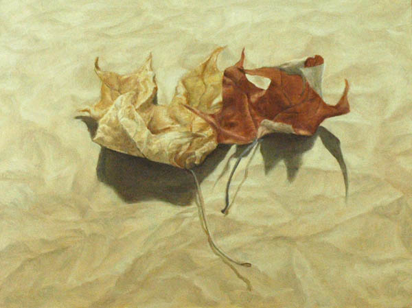 I've been working on this one for a couple of weeks. I don't think it's quite successful, for two reasons. First, in the leaves I kind of got too stuck on fiddly details before I established the large masses, and that affects their dimensionality, especially on the left one. Second, the composition deviates from the still life convention of basically depicting some objects in a box, looking at them against a vertical backdrop. In this composition, you are looking down toward two objects on a flat piece of crumpled brown paper. That would be easier if I hadn't chosen to light them from behind. I thought I could make the perspective work with the shape of the shadows, with the graded lighting (dark to light, front to back) and with receding perspective in the texture of the paper. While I think I did OK, I'm really not quite happy with it. I like deviating from still life compositional conventions, but they are conventions because they work. I'm still learning which rules I have to follow and which I can get away with playing around with.
It's painted on an ABS (styrene) panel, a new product from Real Gesso. I found it really nice to paint on in oils, with just the right grab and absorbency. Full disclosure: they sent this one to me as a free sample, but I am sure that I will be buying some. If you are tired of pre-primed canvases but don't want to have to make your own painting supports, these are a good choice.
The Zone
The zone is the place where you just draw, just paint, and all of your conscious thoughts are focused on making the art happen. The zone can be a hard place to get to, because thoughts continuously intrude. I worry about how other people will perceive the work instead of how to make it right. That's especially the case when I'm in an art class or figure drawing session, where it's easy to start feeling like either (a) everyone else knows what they are doing and you don't; or (b) you are the master and their work is completely lame. Either of those attitudes takes you away from the work, and away from the zone. When you are in the zone, any comparison to other work is irrelevant.
When I start to work on drawing or painting, the first thing I try to consciously do is leave ego and performance anxiety behind. The art comes from someplace else, so there isn't any reason to worry and there is no reason to feel superior. It is what it is. If I make something that sucks, then that's where I'm at today and I need to work through it and learn from my mistakes. If I'm on top of the world today and everything is working, then focusing on anything else but just doing the work will take me away from making good art. It's a similar feeling to martial arts, in which there are times when you are completely in your body, know absolutely where you are and where your opponent is, and can watch in a sort of detached way as a match progresses and your body does what it needs to do. With practice, it becomes easier to know what it feels like to be in the zone and create the mental preconditions that allow that to happen again.
When I start to work on drawing or painting, the first thing I try to consciously do is leave ego and performance anxiety behind. The art comes from someplace else, so there isn't any reason to worry and there is no reason to feel superior. It is what it is. If I make something that sucks, then that's where I'm at today and I need to work through it and learn from my mistakes. If I'm on top of the world today and everything is working, then focusing on anything else but just doing the work will take me away from making good art. It's a similar feeling to martial arts, in which there are times when you are completely in your body, know absolutely where you are and where your opponent is, and can watch in a sort of detached way as a match progresses and your body does what it needs to do. With practice, it becomes easier to know what it feels like to be in the zone and create the mental preconditions that allow that to happen again.
Edges
I'm just beginning to understand the use of edge control in painting. Edges are important in part because they are such an important part of the brain's visual processing system. You have cells in your optic nerve that do nothing but respond when they detect a sharp transition from one tone to another. Without sophisticated edge processing algorithms built into your visual cortex, the world would be a confusing, blurry jumble. The reason why we respond so strongly to line drawings, even though line doesn't really exist like that in nature, is precisely because our brains are designed to interpret edges—sharp tonal transitions—as if they were the prime determinant of three dimensional space.
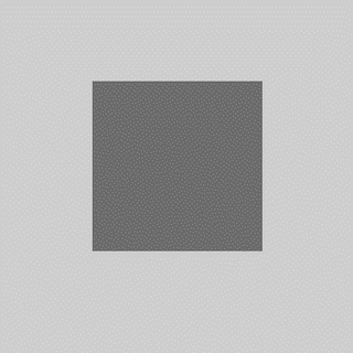
You can see this processing system at work. Take a look at the inside and outside edges of the dark gray square. Around the outside of the dark shape, you can see a slight halo of lighter gray. Inside the dark square, you can see a slightly darker gray. That's not what's actually there—it's the lower levels of your optic nerve saying "I found an edge! I found an edge! It's right here!"
Photographers control edges through the manipulation of focus. The subject of the photo is generally in focus, with hard edges, while the rest of the photo may be blurred and out of focus. That mimics the way your eye works. At any given time, only the very center of your visual field is clear. In part that's because your eye, like a camera lens, can only focus at one distance at a time. But more importantly, only the very center part of your retina—the fovea—has a high density of visual receptor cells. Only foveal vision has any degree of detail; the rest is just a vague blur. You are generally not aware of how tiny your window of detailed vision is, because your brain hides that annoying detail from you. You naturally move your eye around whatever you are looking at, and your brain pieces together an internal conceptual image in which you have the illusion of seeing, at any given moment, a far larger region of detailed information than your eyes are actually delivering to you. In fact, you can't choose not to move your eyes around—even though you may be staring at one spot, there is a slight movement of your eye muscles.
The strongest signal of what is in focus, and what is within foveal vision, is the hard edge. Outside of the eye's focal point, and outside of foveal vision, all edges are blurred. Within that zone, any edges that have a strong value transition are emphasized and used by the visual system to develop a conceptual model of three-dimensional visual space.
Painters have the ability to control the sharpness of any edge they wish. An edge can be sharp, completely blurred, or somewhere in between. Over the course of it's length, you can make an edge change from hard to soft and back to hard again. You can also "lose" an edge by having it blend into it's background, present only by inference. The systematic use of hard, soft, and lost edges is a powerful tool for composition and control of the viewer's eye. Because the eye is attracted by hard edges, you can enhance the hardness of whatever you want the viewer to look at more. You can make visual pathways of hard edges that define how the eye enters and moves around the composition. You can suggest shape by making receding edges softer. You can create a sense of mystery and visual engagement by hiding some edges, requiring the viewer to participate in the process of creating the picture by creating edges where you haven't actually painted them.
Prior to the development of the Venetian style of painting in the early 16th century (Bellini, Giorgione, Titian), edges were usually painted hard, except where soft transitions were required to represent soft forms, forms in shadow, forms in the distance, or turning edges. The Venetian school painters (and all of the vast number of artist influenced by them, such as Rembrandt, Rubens, Velázquez, and just about everyone since then) developed ways to use edges as a compositional device. If you paint all edges except those around your focal point as soft, then the eye is naturally drawn to that area. If you paint objects that are closer to the viewer as having harder edges, then those objects appear closer and you effectively define the three-dimensional space of the picture. If you paint a variety of hard, soft, and lost edges, you increase the complexity of the painting and invite the viewer to explore the composition.
Someday, I'll be able to make all that work in my compositions without effort. In the meantime, it helps to understand the theory, study paintings that use edges effectively (such as those by Ingres), and become more conscious of how I use edges in composition.
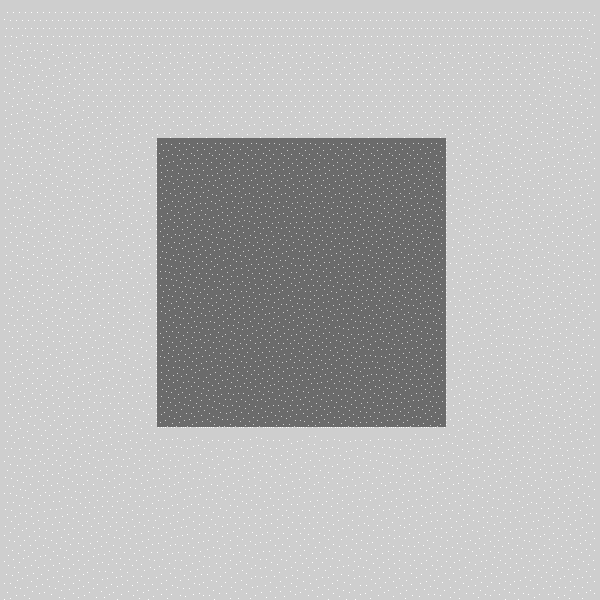
You can see this processing system at work. Take a look at the inside and outside edges of the dark gray square. Around the outside of the dark shape, you can see a slight halo of lighter gray. Inside the dark square, you can see a slightly darker gray. That's not what's actually there—it's the lower levels of your optic nerve saying "I found an edge! I found an edge! It's right here!"
Photographers control edges through the manipulation of focus. The subject of the photo is generally in focus, with hard edges, while the rest of the photo may be blurred and out of focus. That mimics the way your eye works. At any given time, only the very center of your visual field is clear. In part that's because your eye, like a camera lens, can only focus at one distance at a time. But more importantly, only the very center part of your retina—the fovea—has a high density of visual receptor cells. Only foveal vision has any degree of detail; the rest is just a vague blur. You are generally not aware of how tiny your window of detailed vision is, because your brain hides that annoying detail from you. You naturally move your eye around whatever you are looking at, and your brain pieces together an internal conceptual image in which you have the illusion of seeing, at any given moment, a far larger region of detailed information than your eyes are actually delivering to you. In fact, you can't choose not to move your eyes around—even though you may be staring at one spot, there is a slight movement of your eye muscles.
The strongest signal of what is in focus, and what is within foveal vision, is the hard edge. Outside of the eye's focal point, and outside of foveal vision, all edges are blurred. Within that zone, any edges that have a strong value transition are emphasized and used by the visual system to develop a conceptual model of three-dimensional visual space.
Painters have the ability to control the sharpness of any edge they wish. An edge can be sharp, completely blurred, or somewhere in between. Over the course of it's length, you can make an edge change from hard to soft and back to hard again. You can also "lose" an edge by having it blend into it's background, present only by inference. The systematic use of hard, soft, and lost edges is a powerful tool for composition and control of the viewer's eye. Because the eye is attracted by hard edges, you can enhance the hardness of whatever you want the viewer to look at more. You can make visual pathways of hard edges that define how the eye enters and moves around the composition. You can suggest shape by making receding edges softer. You can create a sense of mystery and visual engagement by hiding some edges, requiring the viewer to participate in the process of creating the picture by creating edges where you haven't actually painted them.
Prior to the development of the Venetian style of painting in the early 16th century (Bellini, Giorgione, Titian), edges were usually painted hard, except where soft transitions were required to represent soft forms, forms in shadow, forms in the distance, or turning edges. The Venetian school painters (and all of the vast number of artist influenced by them, such as Rembrandt, Rubens, Velázquez, and just about everyone since then) developed ways to use edges as a compositional device. If you paint all edges except those around your focal point as soft, then the eye is naturally drawn to that area. If you paint objects that are closer to the viewer as having harder edges, then those objects appear closer and you effectively define the three-dimensional space of the picture. If you paint a variety of hard, soft, and lost edges, you increase the complexity of the painting and invite the viewer to explore the composition.
Someday, I'll be able to make all that work in my compositions without effort. In the meantime, it helps to understand the theory, study paintings that use edges effectively (such as those by Ingres), and become more conscious of how I use edges in composition.
16 November 2006
Payne's grey
is usually a convenience mixture of a black and one or two other colors that creates a cool dark grey. I don't find paints like that useful, because I can so easily mix them myself. On one or two occasions, I've encountered someone in an online art forum who avoids black because it is a "dead color," but uses Payne's grey. How is that different from having black on your palette?
Another good one is King's Blue, which usually a mixture of pthalo or ultramarine blue and white. What exactly is the point?
I try to pay attention to which pigments are in the paints I buy. I have a few multi-pigment paints left over from before I got more focused on color, and I still use those from time to time. But for the most part I stick with single-pigment paints. They provide more flexibility and a higher maximum chroma (because mixing paints reduces chroma). I also much prefer to work with and understand the individual character of particular pigments, which is something I can't do with convenience mixtures.
14 November 2006
Some more thoughts on egg tempera
"Tempera isn't hard. It's just slow."I've been playing a bit more with egg tempera lately, and remembering why I like it so much. I can understand why tempera went largely out of fashion in the 16th century: oil paint has a greater value range (because oil darks are darker than tempera darks), so much can be done with blending in oil, and oil paint is perhaps more resistant to damage (although tempera doesn't crack and yellow as oil does).
—George Tooker
Tempera, however, has its own properties to recommend it.
- Many colors have more chroma and delicacy in tempera than in oil. Ultramarine blue, for example, is lighter and more saturated in tempera than in oil—it's like a different color. Earth pigments have a clarity and vibrancy that they do not have in oil. And earths that are barely distinguishable from each other in oil paint have very distinctive characters in tempera. Siennas, red ochres, yellow ochres, golden ochres, green umbers, red umbers, burnt siennas, hematites, malachites, and so many other earths have properties that cannot be fully explored in oil paint, but which really come into their own when tempered with egg yolk.
- In tempera, pigments do not loose as much chroma when mixed with white or black as they do in oil. Tints are less chalky and shades are less dull. In tempera, you can work with higher chroma without looking garish the way really intense oil paints do. That helps to compensate for the reduced value range and gives tempera paintings a sense of delicacy and refinement without dullness.
- In oil paint, you can glaze, scumble, and partially mix multiple colors to achieve interesting optical mixtures. In tempera, the closest you can come to that is the petit lac technique common in Greek and Russian icon painting: you put a wet puddle on a panel that is horizontal and use the brush to very gently spread the paint without breaking the surface tension. That results in interesting, slightly mottled surface effects. In tempera, you can also use layer after layer of crosshatching, weaving colors across and over each other, to produce subtle optical effects.
If you have an interest in egg tempera, I can't recommend "The Practice of Tempera Painting" by Daniel V. Thompson highly enough. It covers the preparation of supports and grounds, choosing and working with pigments, doing underdrawings, application of paint, and gilding. I would only note that (a) you don't really have to grind modern pigments with a muller and slab; you can just put them in a jar with water and shake; (b) his list of pigments is a little dated; and (c) we now know that Italian tempera painters did not use a detailed underdrawing as a critical component of the development of a painting's value scale. Other than those details, the information in the book is as useful today as it was when the second edition was published in 1962.
08 November 2006
You say "sfumah-to," I say "sfumay-to"
In the excellent Giotto to Dürer: Early Renaissance Painting in the National Gallery, there is a description of the painting technique Leonardo used for most of his later work, including the Mona Lisa. This technique, which he called sfumato ("smoke-like"), creates a sense of three-dimensional light and shade that is different from that of his contemporaries.
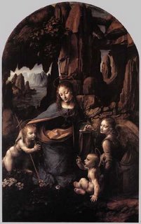
I have seen references that said that the sfumato technique was simply to blend with the fingers. Leonardo certainly did that, but you can find fingerprints in oil paintings from before his birth, so finger painting is hardly unique to his style. Instead, it is based on his observations of smoke. He observed that smoke. which is semi-opaque, looks white against a dark background and dark against a light background. So he decided to make use of the optical properties of lead white paint in a similar manner. He would begin by applying a very dark underpainting in black, earth tones, and possibly a transparent bituminous brown. This underpainting was rather loose and thin, probably diluted with naphtha or oil of spike lavender (almost no other 15th century painters appear to have used solvents for painting, so Leonardo is probably the inventor of the washy underpainting). He would then apply scumbles and glazes over the dark underpainting in muted colors mixed with white. The method produces smoky, opalescent transitions from dark to light that are quite beautiful and quite unlike other painting in that period.
By the way, I want this Da Vinci t-shirt.
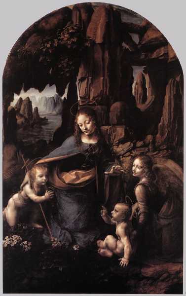
I have seen references that said that the sfumato technique was simply to blend with the fingers. Leonardo certainly did that, but you can find fingerprints in oil paintings from before his birth, so finger painting is hardly unique to his style. Instead, it is based on his observations of smoke. He observed that smoke. which is semi-opaque, looks white against a dark background and dark against a light background. So he decided to make use of the optical properties of lead white paint in a similar manner. He would begin by applying a very dark underpainting in black, earth tones, and possibly a transparent bituminous brown. This underpainting was rather loose and thin, probably diluted with naphtha or oil of spike lavender (almost no other 15th century painters appear to have used solvents for painting, so Leonardo is probably the inventor of the washy underpainting). He would then apply scumbles and glazes over the dark underpainting in muted colors mixed with white. The method produces smoky, opalescent transitions from dark to light that are quite beautiful and quite unlike other painting in that period.
By the way, I want this Da Vinci t-shirt.
Never use a brush smaller than your head
Once piece of oil painting conventional wisdom goes along the lines of "find a brush size you are comfortable with, then get a larger brush and use that." The idea is that larger brushes help you to paint in large abstract masses rather than getting stuck on fiddly little details.
For my part, I tried using larger brushes than I felt comfortable with for some time. I felt like I was trying to paint with a cat. After a couple of months, it wasn't any better. So I got some smaller brushes, and finally felt like I could control the paint. Although it's important to understand the need to see the big picture and work from larger to smaller, my advice is to not take that principle to an extreme. If a big brush is helpful, then use that. If smaller brushes let you get the job done more effectively, then use those. Often, it's a good idea to work from larger brushes to smaller ones as the painting progresses, but don't drive yourself nuts with a brush you can't control.
For my part, I tried using larger brushes than I felt comfortable with for some time. I felt like I was trying to paint with a cat. After a couple of months, it wasn't any better. So I got some smaller brushes, and finally felt like I could control the paint. Although it's important to understand the need to see the big picture and work from larger to smaller, my advice is to not take that principle to an extreme. If a big brush is helpful, then use that. If smaller brushes let you get the job done more effectively, then use those. Often, it's a good idea to work from larger brushes to smaller ones as the painting progresses, but don't drive yourself nuts with a brush you can't control.
07 November 2006
Egg tempera
is a type of paint made by mixing pigment with egg yolk.* This week I've been working on an egg tempera study (several figures copied from paintings by Fra Angelico), to use as a demo piece for the Renaissance painting workshop I'm doing at Wetcanvas and for an egg tempera class my wife and I will be teaching at a Society for Creative Anachronism event this Saturday.
I hadn't done much tempera in the last year. I forgot what a beautiful medium it is. The painting process is to apply many fine hatching strokes with a dry brush, building up value slowly in a manner similar to working with a graphite pencil. The result is unlike any other medium. At first it's frustrating, because I make a lot of little mistakes. Drat! I have too much paint on the brush. Akk! There's still too much paint. Gah! I'm painting over an area that's still wet and the paint is coming up. If you are trying to build tone, you gradually weave strokes back and forth, back and forth. You get into a kind of mental zone and suddenly it looks exactly right.
I need to do more tempera painting.
*If you are unfamiliar with painting media, please don't confuse egg tempera with "tempera" poster paints for children. Other than being kinds of paint, they have nothing at all to do with each other.
01 November 2006
I did a lot of complaining about bad use of chroma
in my last post. I was grousing about artists who use high chroma colors indiscriminately. So I thought I'd provide an example of a good painting with lots of intense color.
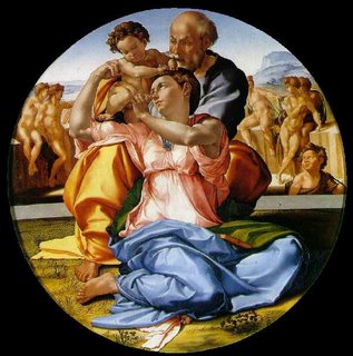
This is the Doni Tondo by Michelangelo. Notice the bright colors in the drapery, which dominate the painting. Yet Michelangelo has carefully provided rests of dark dull colors and lighter tints. He uses chroma brilliantly.
So I don't have a problem with high chroma, just clueless chroma.
It's called the "Doni Tondo," by the way, because it was commissioned for the daughter of a guy whose last name was Doni. A tondo, of course, is a round painting. It was painted circa 1506, when Michelangelo was 31 years old.
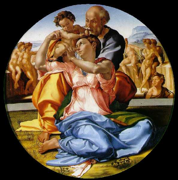
This is the Doni Tondo by Michelangelo. Notice the bright colors in the drapery, which dominate the painting. Yet Michelangelo has carefully provided rests of dark dull colors and lighter tints. He uses chroma brilliantly.
So I don't have a problem with high chroma, just clueless chroma.
It's called the "Doni Tondo," by the way, because it was commissioned for the daughter of a guy whose last name was Doni. A tondo, of course, is a round painting. It was painted circa 1506, when Michelangelo was 31 years old.
31 October 2006
Practical color mixing 3: chroma
This is the third post on mixing color. The first was about value and the second was about hue. Now it's time to talk about chroma.
As with value and hue, the best way to identify chroma is in terms of relationships. How intense is the color you're looking at compared with the intensity of other colors around it? Chroma can be hard to separate out from value; light colors sometimes look more intense than they are, and dark colors sometimes look less intense. You get better with practice.
Many artists—mostly amateurs, but also some professionals—seem to have trouble identifying chroma correctly. They often paint at a higher chroma than what they see, and they often seem unaware that they are doing so. Let me give you an example. I was browsing through art books in a bookstore the other day and found one about the painting techniques of the impressionists. It’s a very well written book, based on lots of research on the individual methods of many 19th century artists. There are a number of demonstrations in which the author copies a section of an impressionist painting, using the methods of the original artist. In every single case, throughout the entire book, the author gets the chroma badly wrong and pretty much everything else right. In particular, almost every color is one or two chroma steps higher than the corresponding color in the original. Impressionists were not known for making dull pictures, but the author felt the need to “improve” the originals by bumping the chroma, even though she was clearly making a serious attempt to use the same or similar pigments and techniques. What’s more, I don’t think she knew she was doing it. I think she believed she was doing precise copies, but failed to see chroma differences right in front of her face. That’s just a guess on my part; some of the pigments used in the typical impressionist palette were fugitive, so she might have been deliberately compensating for their tendency to fade. But if that’s the case, I couldn’t find where she told us that, and she was certainly increasing the chroma even in areas corresponding to those painted with lightfast pigments. So either the reproductions in the book are badly messed up (and no one caught it) or this artist has a remarkable insensitivity to chroma.
I see similar errors on internet forums in which amateur artists post copies of old master works. The chroma is usually too high—often much, much too high. That might have something to do with how the work has been photographed, digitized, and presented on computer monitors, but in case after case, the posted copy appears consistently more chromatic than the original, even when the artist has shown them side by side. The artists usually seem unaware of this difference, and sometimes have trouble seeing it even when it is pointed out to them.
There is, of course, nothing wrong with deliberately pushing chroma for dramatic or decorative effect. I do it myself sometimes. My concern is with artists who do this unthinkingly, either because they just have an unconscious bias toward “brighter” color, or because they think that chromatic colors are always better or prettier. I think part of the problem is that we have been conditioned to think about pictures in terms of photography. Many artists work from photographs, and even those who do not have spent a lot of time looking at photographs. Most color films and developing methods are deliberately designed to push the chroma, and most consumer digital cameras are designed to do so as well. That makes the scene more “colorful,” and many people seem to think that a “good” snapshot is one that has a lot of chroma, regardless of how chromatic the original scene was. Over time, we’ve become accustomed to looking at pictures with lots of color intensity. That’s what we think pictures are supposed to look like. And, I suppose, many of those who buy art think that way as well, so there may be a commercial incentive to paint very “colorful” pictures.
If you are looking to make a painting that seems like it is full of color, the problem is this: if you are looking at an array of high-chroma colors, the visual system habituates. We see chroma (and other aspects of color) in terms of relationships at least as much as we see absolute values. A whole bunch of intense colors looks lurid, but it doesn't give the impression of a really colorful scene. The better impressionist painters, for all of their emphasis on a modern palette of intense colors, understood this. They used chroma carefully, calculating the effect of one color against another. They were able to get high chroma colors to really stand out by juxtaposing them against much duller colors or dull optical mixtures, deliberately creating a strong visual contrast. That’s something the author of that book on impressionist technique didn’t seem to understand, for all of her impressive technical knowledge of impressionist methodologies. She’s looked at hundreds of impressionist paintings and copied dozens of them, yet she fails to see how those artists used chromatic contrast. Her copies, as a result, are much less interesting than the originals.
If you like color, then learn how to identify the chroma you see around you. Learn how to mix and use subtle mixtures of neutral and near-neutral colors. If you like intense colors, learn how to create the visual impression of really high chroma by using contrast, rather than just blasting away with unmixed colors right out of the tube and hoping the viewer likes “colorful” art. Even today, with a viewing public accustomed to artificially enhanced color, there are plenty of really good artists who know how to use color more effectively, and they stand out from those who do not. So let’s put an end to chroma cluelessness.
I’ll close my little editorial rant here with this: Enough with those bright orange skin tones already! Even Caucasians who spend way too much time in tanning booths have skin that’s way less intense than cadmium red mixed with yellow ochre, or any of the other ways to mix luridly awful skin tones. Thank you very much.
We’ll now return to your regularly-scheduled paint mixing post.
Working with low-chroma color
Almost all paints are high in chroma right out of the tube. Since most of the world is low in chroma, the majority of a realistic painting will consist of neutrals and near-neutrals. So a realist painter is going to have to spend a lot of mixing time reducing the chroma of paint.
How do you do that? At one level, it's easy because, most of the time, whenever you mix one blob of paint with another blob of paint, you end up with something lower in chroma. By that, I mean that the result is less intense than the brighter of the two colors. Often, it's less intense than either of them. So if you want to reduce the chroma of a paint color, pick another paint that's lower in chroma smoosh them together. The problem, of course, is that if you also want to have control over hue and value, you’re going to have to pick your mixtures carefully.
Reducing chroma with mixing complements
A common method of chroma reduction is to mix in a complementary or near-complementary paint. For example, if you want to reduce the chroma of a bright pthalo green, mix in a violet-red (i.e., a magenta). Complements will usually reduce both chroma and value. You also sometimes get hue shifts when mixing colors from the other side of the color mixing wheel—the mixture follows a curved path around the wheel rather than a straight path toward the center. Because of the peculiarities of individual pigments, there is no way to predict these hue shifts without just mixing two paints together and seeing what happens. You can pull the mixture back to the original hue, however, by adding a third paint that is complementary to the color you’ve mixed. Once you have the hue and chroma right, you’ll need to check to see if the value has now been brought too low. Of course, if you add white to increase the value, the chroma will be decreased. So the method of adding the complement can result in frustration as you try to chase the color of a mixture to the right combination of value, hue, and chroma. For low-chroma colors, I find this process much less frustrating when I start with fairly low-chroma paints, such as earth colors and a few others. That way, I do less chasing of color and less mixing overall. It’s also easier if you mix each color to the correct value first, then mixing them together for the desired hue and chroma.
Yellows and violets, although they are on opposite sides of the color mixing wheel, don’t work well as complements (the hues shift severely rather than mixing toward neutrals). To dull down a yellow, it is easiest to mix in a duller yellow or orange, such as raw umber or raw sienna. You can also mix in a neutral gray of the same value (see below). To get a dull violet, the easiest course is often to ignore violet pigments and mix your own violet. Because mixing reduces chroma, the right combination of red and blue will give you a violet of the desired degree of dullness. A good dark dull violet can be made with ultramarine blue and burnt sienna, for example.
Other than yellow and violet, it is very helpful to experiment with, and memorize, pairs of complementary colors. As a general rule, if you want to dull down an intense color, choose a dull complement. Blues have mixing complements in the range of warm yellows, oranges, and middle reds. Middle and cool greens have mixing complements in the range from middle reds to violets. Warm greens have mixing complements among the violets. Some of my favorite mixing complements include raw sienna/ultramarine blue, viridian/pyrol ruby, Prussian blue/Venetian red, and ultramarine blue/raw umber. I expect that most artists develop a set of strongly preferred mixing complements.
Reducing chroma with optical color mixing
If you put a bunch of small dabs of different colored high chroma paints next to each other, then step back far enough, they will blend optically and look like one color. The perceived color will resemble what you would get if you mixed all of those colors together—i.e., it will be lower in chroma than the colors that go into it. If you take this approach to extremes, you get pointillism, which I don’t personally find to be very attractive or effective. Used with more subtlety, however, optical mixing can be one of the best ways to make neutrals, because by controlling the structure of paint blobs, you can create effects that are much more visually interesting than a flat region of neutral color. The eye sees the optical blend, but is also aware of the color variation. You can partially blend colors together, layer them on top of each other while allowing different amounts of lower colors to show through, create interesting textures, or use any of a number of techniques for optical color blending.
Reducing chroma with white
Almost all colors lose chroma when mixed with white (as I’ve already noted, a few dark cool transparent pigments show an initial increase in chroma when mixed with a little white, then drop chroma as they are lightened further). Of course, they also get lighter, but dull light colors are often exactly what you want. For example, imagine that you are painting a piece of blue cloth. The part of the cloth that is highest in chroma will be the “midtones”—the part of the cloth that is illuminated, but is near the form shadow boundary (the terminator) and turning away from the light. As the form turns toward the light it gets lighter in value and also less chromatic. You can create the same effect with paint by mixing a blue color (cobalt blue, say) with more and more white as it turns toward the light. The paint becomes lighter and less chromatic, just as the blue cloth does. You may need to adjust the mixture to make the chroma, value, and hue changes exactly model what you are seeing in front of you, but just mixing with the appropriate amount of white gets you into the right ball park.
Sometimes, you’ll find that white reduces chroma faster than you want it to. The mixture becomes “chalky.” I’ll discuss how to deal with that problem below, when I talk about high chroma color mixing.
A color that has been lightened by mixing with white is called a tint. Tints are high in value and low in chroma. They are also called “pastels.”
Reducing chroma with grey
Instead of using mixing complements, it is possible to reduce the chroma of a mixture without having much effect on value or hue. To do that, use a neutral gray of the same value. The chroma will go down without significantly affecting the other parameters of color. Black mixed with white does not make a neutral gray—it’s much too cool. A 50/50 mixture of ivory black and raw umber, however, is very close to neutral. Adjust the value of this mixture by adding whatever amount of white is required. You may want to mix up a string of neutral grays in advance and use them to easily adjust chroma. You can also buy a set of neutral gray oil paints from Studio Products, graded according to Munsell chroma intervals.
So here’s a good way to work with low-chroma colors without driving yourself nuts. First, start with low-chroma colors such as earths. They will still be too high in chroma for a lot of purposes, but they are a lot closer than, say, a cadmium red light. Second, pre-mix strings of colors you’re likely to use. Each string is one hue, ranging in value from the lowest you will need to the highest. Also mix a string of neutral grays in the same value range. Small chroma adjustments are fairly easy with nudges of small amounts of complementary colors. When you need to pull the chroma down significantly, first mix the right hue and value from combinations of paint from your strings and, if needed, nudges of other colors on your palette. Then adjust the chroma downward by adding some of your neutral gray at the same value as the mixture you’re working with.
Reducing chroma with glazing
If you paint one color thinly over another color, you get an optical mixture. Blue glazed over yellow produces a green, for example. You can use this effect to reduce chroma, since an optical mixture is darker and duller than the colors that make it up. Michelangelo, for example, sometimes made a dark dull blue by glazing ultramarine over black.
The browns and the brown-ish
It’s worth briefly discussing brown colors. Brown doesn’t appear in the visual spectrum or in the named colors on the outside of a color mixing wheel. Colors labeled “brown” are yellows and oranges that are fairly dark and low in chroma. Brown, therefore, isn’t a color per se: it’s a zone within the overall color mixing wheel. There are plenty of earth colors that start out in the zone of brown, and a few non-earths as well. To make a bright yellow or orange more brownish, it needs to be dulled down and darkened (mixing with white won’t do it; you get a pastel tint). If you mix a yellow or orange with a gray of equal value, you will usually get something you could call a brown. If you mix with black, you will almost always get a brown. Some yellows, when reduced in chroma with grey or black, shift their hue toward green. Just a touch of grey or black makes a green gold; more grey or black makes a greenish umber-like color. Bright yellow-reds (oranges), if dulled down with grey or black, make more clearly brown colors, without those green tones. Bright reds, if dulled down with grey or black, make a maroon.
A color that has been darkened by mixing with black is called a shade. So a mixture of cadmium red and black would be a shade of cadmium red. Because even a little bit of black reduces chroma drastically, some artists banish black from their palette, claiming that it is a “dead” color. That’s silly, because there are times when you want dark colors that are very low in chroma. The real world has such colors in it, after all, and many great Old Master paintings were made with the liberal use of black. Nevertheless, you should be aware of how powerful black is as a reducer of chroma and use it with care.
For almost all colors, chroma is highest with paint straight out of the tube. Some pigments that are dark and transparent (such as Prussian blue or pthalo green) reach maximum chroma with the addition of a little white. Generally, however, if you want high really high chroma, the way to get it is to have a tube of paint with exactly the right hue and value, and just paint with that. Sometimes, you can make that work. At other times, you don’t have quite the right color, or the right color just doesn’t exist in pigment form.
The highest chroma mixtures are blends of high-chroma paints of similar hue. If your cerulean blue is just a bit too greenish, don’t mix it with red, mix it with a high chroma middle blue such as cobalt blue. You want to draw a line through the color mixing wheel that stays as close to the outside of the wheel as possible. So if you like to work with a lot of high chroma colors, then it’s to your advantage to have many tubes of high-chroma paint. That way, when you want a particular color, you will usually have two colors that are similar enough to that color that you can mix them without taking too much of a hit to the chroma.
Warm colors are at their highest chroma when they are fairly light (high in value). Cool colors are at their highest chroma when they are relatively dark. At maximum chroma, warm colors are more chromatic than cool colors. But that’s OK, because warm colors have higher maximum chroma in the real world as well. If you want cool colors to compete for the viewer’s attention with warm colors, however, you’ll need to keep that difference in mind.
Simultaneous contrast
Because of the way the visual system works, a color is perceived as more chromatic when it is placed next to its visual complement. The impressionists made frequent use of this principle. A bright magenta looks more intense when it is surrounded by a dull green. The complements identified in the Munsell color system more accurately reflect human color vision than those in the antiquated three primary color wheel. Here are the visual complements from the Munsell color wheel:
Masstone and undertone
We like to pretend that pigments, paints, and colors are all the same thing. In reality, pigments have many characteristics separate from their “color.” And pigments behave differently in different binding media. One of the most important aspects of pigment variation is in masstone and undertone. Masstone is a pigment’s color when it is applied thickly. Undertone is a pigment’s color when it is applied in a thin layer. Lots of pigments display a huge difference between masstone and undertone, and that often has a lot to do with chroma. Most commonly, masstone is duller than undertone. The difference is most marked with relatively transparent pigments, but many opaque pigments show significant differences as well. For example, in the self portrait I did earlier this year, the background consists of yellow ochre glazed thinly over white paint. Yellow ochre is generally described as a dull pigment, and in masstone that’s true. But the background of the painting is quite intense. The hue is also much more orange than that of yellow ochre in masstone. We get so used to application of paint in thicknesses that make use of masstone that we often forget how paints behave when applied in very thin layers.
Maintaining chroma at high values
With many pigments, it’s hard to get high chroma at high values. Because white lightens the value of paint and also reduces chroma, mixtures with a lot of white become pastel tints. If that’s not what you want, then you may consider the mixture to be “too chalky.” How do you avoid this chalky effect when you’re trying to make light colors that have relatively high chroma?
One way is to start with very high chroma paint. The chroma reducing effect of white is then balanced with a strong base chroma. It can also be a good idea to avoid titanium white, which tints very strongly and can have a greater effect on chroma than other whites. Try zinc white or, if you’re using oil paint, lead white. Studio Products sells an oil paint called “optical white.” It’s zinc white ground with hollow nanosphere particles (really). They claim that this white reduces chroma less than other whites. I haven’t tried it (yet), but because their other products are so excellent I think it’s worth consideration.
Maintaining chroma by glazing
One effective way to maintain chroma is by glazing. If you apply paint very thinly over white, you can get a higher chroma than you could by mixing that paint to the same value using white. And a transparent paint that is applied a little more thickly can be more chromatic at low values than you might be able to obtain with a mixture of the same hue.
Identifying chroma
As with value and hue, the best way to identify chroma is in terms of relationships. How intense is the color you're looking at compared with the intensity of other colors around it? Chroma can be hard to separate out from value; light colors sometimes look more intense than they are, and dark colors sometimes look less intense. You get better with practice.
Bad chroma!
Many artists—mostly amateurs, but also some professionals—seem to have trouble identifying chroma correctly. They often paint at a higher chroma than what they see, and they often seem unaware that they are doing so. Let me give you an example. I was browsing through art books in a bookstore the other day and found one about the painting techniques of the impressionists. It’s a very well written book, based on lots of research on the individual methods of many 19th century artists. There are a number of demonstrations in which the author copies a section of an impressionist painting, using the methods of the original artist. In every single case, throughout the entire book, the author gets the chroma badly wrong and pretty much everything else right. In particular, almost every color is one or two chroma steps higher than the corresponding color in the original. Impressionists were not known for making dull pictures, but the author felt the need to “improve” the originals by bumping the chroma, even though she was clearly making a serious attempt to use the same or similar pigments and techniques. What’s more, I don’t think she knew she was doing it. I think she believed she was doing precise copies, but failed to see chroma differences right in front of her face. That’s just a guess on my part; some of the pigments used in the typical impressionist palette were fugitive, so she might have been deliberately compensating for their tendency to fade. But if that’s the case, I couldn’t find where she told us that, and she was certainly increasing the chroma even in areas corresponding to those painted with lightfast pigments. So either the reproductions in the book are badly messed up (and no one caught it) or this artist has a remarkable insensitivity to chroma.
I see similar errors on internet forums in which amateur artists post copies of old master works. The chroma is usually too high—often much, much too high. That might have something to do with how the work has been photographed, digitized, and presented on computer monitors, but in case after case, the posted copy appears consistently more chromatic than the original, even when the artist has shown them side by side. The artists usually seem unaware of this difference, and sometimes have trouble seeing it even when it is pointed out to them.
There is, of course, nothing wrong with deliberately pushing chroma for dramatic or decorative effect. I do it myself sometimes. My concern is with artists who do this unthinkingly, either because they just have an unconscious bias toward “brighter” color, or because they think that chromatic colors are always better or prettier. I think part of the problem is that we have been conditioned to think about pictures in terms of photography. Many artists work from photographs, and even those who do not have spent a lot of time looking at photographs. Most color films and developing methods are deliberately designed to push the chroma, and most consumer digital cameras are designed to do so as well. That makes the scene more “colorful,” and many people seem to think that a “good” snapshot is one that has a lot of chroma, regardless of how chromatic the original scene was. Over time, we’ve become accustomed to looking at pictures with lots of color intensity. That’s what we think pictures are supposed to look like. And, I suppose, many of those who buy art think that way as well, so there may be a commercial incentive to paint very “colorful” pictures.
If you are looking to make a painting that seems like it is full of color, the problem is this: if you are looking at an array of high-chroma colors, the visual system habituates. We see chroma (and other aspects of color) in terms of relationships at least as much as we see absolute values. A whole bunch of intense colors looks lurid, but it doesn't give the impression of a really colorful scene. The better impressionist painters, for all of their emphasis on a modern palette of intense colors, understood this. They used chroma carefully, calculating the effect of one color against another. They were able to get high chroma colors to really stand out by juxtaposing them against much duller colors or dull optical mixtures, deliberately creating a strong visual contrast. That’s something the author of that book on impressionist technique didn’t seem to understand, for all of her impressive technical knowledge of impressionist methodologies. She’s looked at hundreds of impressionist paintings and copied dozens of them, yet she fails to see how those artists used chromatic contrast. Her copies, as a result, are much less interesting than the originals.
If you like color, then learn how to identify the chroma you see around you. Learn how to mix and use subtle mixtures of neutral and near-neutral colors. If you like intense colors, learn how to create the visual impression of really high chroma by using contrast, rather than just blasting away with unmixed colors right out of the tube and hoping the viewer likes “colorful” art. Even today, with a viewing public accustomed to artificially enhanced color, there are plenty of really good artists who know how to use color more effectively, and they stand out from those who do not. So let’s put an end to chroma cluelessness.
I’ll close my little editorial rant here with this: Enough with those bright orange skin tones already! Even Caucasians who spend way too much time in tanning booths have skin that’s way less intense than cadmium red mixed with yellow ochre, or any of the other ways to mix luridly awful skin tones. Thank you very much.
We’ll now return to your regularly-scheduled paint mixing post.
Working with low-chroma color
Almost all paints are high in chroma right out of the tube. Since most of the world is low in chroma, the majority of a realistic painting will consist of neutrals and near-neutrals. So a realist painter is going to have to spend a lot of mixing time reducing the chroma of paint.
How do you do that? At one level, it's easy because, most of the time, whenever you mix one blob of paint with another blob of paint, you end up with something lower in chroma. By that, I mean that the result is less intense than the brighter of the two colors. Often, it's less intense than either of them. So if you want to reduce the chroma of a paint color, pick another paint that's lower in chroma smoosh them together. The problem, of course, is that if you also want to have control over hue and value, you’re going to have to pick your mixtures carefully.
Reducing chroma with mixing complements
A common method of chroma reduction is to mix in a complementary or near-complementary paint. For example, if you want to reduce the chroma of a bright pthalo green, mix in a violet-red (i.e., a magenta). Complements will usually reduce both chroma and value. You also sometimes get hue shifts when mixing colors from the other side of the color mixing wheel—the mixture follows a curved path around the wheel rather than a straight path toward the center. Because of the peculiarities of individual pigments, there is no way to predict these hue shifts without just mixing two paints together and seeing what happens. You can pull the mixture back to the original hue, however, by adding a third paint that is complementary to the color you’ve mixed. Once you have the hue and chroma right, you’ll need to check to see if the value has now been brought too low. Of course, if you add white to increase the value, the chroma will be decreased. So the method of adding the complement can result in frustration as you try to chase the color of a mixture to the right combination of value, hue, and chroma. For low-chroma colors, I find this process much less frustrating when I start with fairly low-chroma paints, such as earth colors and a few others. That way, I do less chasing of color and less mixing overall. It’s also easier if you mix each color to the correct value first, then mixing them together for the desired hue and chroma.
Yellows and violets, although they are on opposite sides of the color mixing wheel, don’t work well as complements (the hues shift severely rather than mixing toward neutrals). To dull down a yellow, it is easiest to mix in a duller yellow or orange, such as raw umber or raw sienna. You can also mix in a neutral gray of the same value (see below). To get a dull violet, the easiest course is often to ignore violet pigments and mix your own violet. Because mixing reduces chroma, the right combination of red and blue will give you a violet of the desired degree of dullness. A good dark dull violet can be made with ultramarine blue and burnt sienna, for example.
Other than yellow and violet, it is very helpful to experiment with, and memorize, pairs of complementary colors. As a general rule, if you want to dull down an intense color, choose a dull complement. Blues have mixing complements in the range of warm yellows, oranges, and middle reds. Middle and cool greens have mixing complements in the range from middle reds to violets. Warm greens have mixing complements among the violets. Some of my favorite mixing complements include raw sienna/ultramarine blue, viridian/pyrol ruby, Prussian blue/Venetian red, and ultramarine blue/raw umber. I expect that most artists develop a set of strongly preferred mixing complements.
Reducing chroma with optical color mixing
If you put a bunch of small dabs of different colored high chroma paints next to each other, then step back far enough, they will blend optically and look like one color. The perceived color will resemble what you would get if you mixed all of those colors together—i.e., it will be lower in chroma than the colors that go into it. If you take this approach to extremes, you get pointillism, which I don’t personally find to be very attractive or effective. Used with more subtlety, however, optical mixing can be one of the best ways to make neutrals, because by controlling the structure of paint blobs, you can create effects that are much more visually interesting than a flat region of neutral color. The eye sees the optical blend, but is also aware of the color variation. You can partially blend colors together, layer them on top of each other while allowing different amounts of lower colors to show through, create interesting textures, or use any of a number of techniques for optical color blending.
Reducing chroma with white
Almost all colors lose chroma when mixed with white (as I’ve already noted, a few dark cool transparent pigments show an initial increase in chroma when mixed with a little white, then drop chroma as they are lightened further). Of course, they also get lighter, but dull light colors are often exactly what you want. For example, imagine that you are painting a piece of blue cloth. The part of the cloth that is highest in chroma will be the “midtones”—the part of the cloth that is illuminated, but is near the form shadow boundary (the terminator) and turning away from the light. As the form turns toward the light it gets lighter in value and also less chromatic. You can create the same effect with paint by mixing a blue color (cobalt blue, say) with more and more white as it turns toward the light. The paint becomes lighter and less chromatic, just as the blue cloth does. You may need to adjust the mixture to make the chroma, value, and hue changes exactly model what you are seeing in front of you, but just mixing with the appropriate amount of white gets you into the right ball park.
Sometimes, you’ll find that white reduces chroma faster than you want it to. The mixture becomes “chalky.” I’ll discuss how to deal with that problem below, when I talk about high chroma color mixing.
A color that has been lightened by mixing with white is called a tint. Tints are high in value and low in chroma. They are also called “pastels.”
Reducing chroma with grey
Instead of using mixing complements, it is possible to reduce the chroma of a mixture without having much effect on value or hue. To do that, use a neutral gray of the same value. The chroma will go down without significantly affecting the other parameters of color. Black mixed with white does not make a neutral gray—it’s much too cool. A 50/50 mixture of ivory black and raw umber, however, is very close to neutral. Adjust the value of this mixture by adding whatever amount of white is required. You may want to mix up a string of neutral grays in advance and use them to easily adjust chroma. You can also buy a set of neutral gray oil paints from Studio Products, graded according to Munsell chroma intervals.
So here’s a good way to work with low-chroma colors without driving yourself nuts. First, start with low-chroma colors such as earths. They will still be too high in chroma for a lot of purposes, but they are a lot closer than, say, a cadmium red light. Second, pre-mix strings of colors you’re likely to use. Each string is one hue, ranging in value from the lowest you will need to the highest. Also mix a string of neutral grays in the same value range. Small chroma adjustments are fairly easy with nudges of small amounts of complementary colors. When you need to pull the chroma down significantly, first mix the right hue and value from combinations of paint from your strings and, if needed, nudges of other colors on your palette. Then adjust the chroma downward by adding some of your neutral gray at the same value as the mixture you’re working with.
Reducing chroma with glazing
If you paint one color thinly over another color, you get an optical mixture. Blue glazed over yellow produces a green, for example. You can use this effect to reduce chroma, since an optical mixture is darker and duller than the colors that make it up. Michelangelo, for example, sometimes made a dark dull blue by glazing ultramarine over black.
The browns and the brown-ish
It’s worth briefly discussing brown colors. Brown doesn’t appear in the visual spectrum or in the named colors on the outside of a color mixing wheel. Colors labeled “brown” are yellows and oranges that are fairly dark and low in chroma. Brown, therefore, isn’t a color per se: it’s a zone within the overall color mixing wheel. There are plenty of earth colors that start out in the zone of brown, and a few non-earths as well. To make a bright yellow or orange more brownish, it needs to be dulled down and darkened (mixing with white won’t do it; you get a pastel tint). If you mix a yellow or orange with a gray of equal value, you will usually get something you could call a brown. If you mix with black, you will almost always get a brown. Some yellows, when reduced in chroma with grey or black, shift their hue toward green. Just a touch of grey or black makes a green gold; more grey or black makes a greenish umber-like color. Bright yellow-reds (oranges), if dulled down with grey or black, make more clearly brown colors, without those green tones. Bright reds, if dulled down with grey or black, make a maroon.
A color that has been darkened by mixing with black is called a shade. So a mixture of cadmium red and black would be a shade of cadmium red. Because even a little bit of black reduces chroma drastically, some artists banish black from their palette, claiming that it is a “dead” color. That’s silly, because there are times when you want dark colors that are very low in chroma. The real world has such colors in it, after all, and many great Old Master paintings were made with the liberal use of black. Nevertheless, you should be aware of how powerful black is as a reducer of chroma and use it with care.
Working with high-chroma color
For almost all colors, chroma is highest with paint straight out of the tube. Some pigments that are dark and transparent (such as Prussian blue or pthalo green) reach maximum chroma with the addition of a little white. Generally, however, if you want high really high chroma, the way to get it is to have a tube of paint with exactly the right hue and value, and just paint with that. Sometimes, you can make that work. At other times, you don’t have quite the right color, or the right color just doesn’t exist in pigment form.
The highest chroma mixtures are blends of high-chroma paints of similar hue. If your cerulean blue is just a bit too greenish, don’t mix it with red, mix it with a high chroma middle blue such as cobalt blue. You want to draw a line through the color mixing wheel that stays as close to the outside of the wheel as possible. So if you like to work with a lot of high chroma colors, then it’s to your advantage to have many tubes of high-chroma paint. That way, when you want a particular color, you will usually have two colors that are similar enough to that color that you can mix them without taking too much of a hit to the chroma.
Warm colors are at their highest chroma when they are fairly light (high in value). Cool colors are at their highest chroma when they are relatively dark. At maximum chroma, warm colors are more chromatic than cool colors. But that’s OK, because warm colors have higher maximum chroma in the real world as well. If you want cool colors to compete for the viewer’s attention with warm colors, however, you’ll need to keep that difference in mind.
Simultaneous contrast
Because of the way the visual system works, a color is perceived as more chromatic when it is placed next to its visual complement. The impressionists made frequent use of this principle. A bright magenta looks more intense when it is surrounded by a dull green. The complements identified in the Munsell color system more accurately reflect human color vision than those in the antiquated three primary color wheel. Here are the visual complements from the Munsell color wheel:
- Yellow <—> purple blue
- Green yellow <—> purple
- Green <—> red purple
- Blue green <—> red
- Blue <—> yellow red
Masstone and undertone
We like to pretend that pigments, paints, and colors are all the same thing. In reality, pigments have many characteristics separate from their “color.” And pigments behave differently in different binding media. One of the most important aspects of pigment variation is in masstone and undertone. Masstone is a pigment’s color when it is applied thickly. Undertone is a pigment’s color when it is applied in a thin layer. Lots of pigments display a huge difference between masstone and undertone, and that often has a lot to do with chroma. Most commonly, masstone is duller than undertone. The difference is most marked with relatively transparent pigments, but many opaque pigments show significant differences as well. For example, in the self portrait I did earlier this year, the background consists of yellow ochre glazed thinly over white paint. Yellow ochre is generally described as a dull pigment, and in masstone that’s true. But the background of the painting is quite intense. The hue is also much more orange than that of yellow ochre in masstone. We get so used to application of paint in thicknesses that make use of masstone that we often forget how paints behave when applied in very thin layers.
Maintaining chroma at high values
With many pigments, it’s hard to get high chroma at high values. Because white lightens the value of paint and also reduces chroma, mixtures with a lot of white become pastel tints. If that’s not what you want, then you may consider the mixture to be “too chalky.” How do you avoid this chalky effect when you’re trying to make light colors that have relatively high chroma?
One way is to start with very high chroma paint. The chroma reducing effect of white is then balanced with a strong base chroma. It can also be a good idea to avoid titanium white, which tints very strongly and can have a greater effect on chroma than other whites. Try zinc white or, if you’re using oil paint, lead white. Studio Products sells an oil paint called “optical white.” It’s zinc white ground with hollow nanosphere particles (really). They claim that this white reduces chroma less than other whites. I haven’t tried it (yet), but because their other products are so excellent I think it’s worth consideration.
Maintaining chroma by glazing
One effective way to maintain chroma is by glazing. If you apply paint very thinly over white, you can get a higher chroma than you could by mixing that paint to the same value using white. And a transparent paint that is applied a little more thickly can be more chromatic at low values than you might be able to obtain with a mixture of the same hue.
24 October 2006
Jan van Eyck
was credited by the 16th century artist and biographer Vassari as the inventor of oil painting. That's not the case, but in the early 15th century he was one of the pioneers of the modern use of oil painting as a primary painting medium.
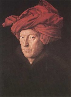
Apparently, he had a sense of humor. This painting, which may be a self-portrait, was made with a frame carved as part of the panel. At the bottom, it's inscribed (in Greek letters in the Flemish language) with what appears to be a pun. It can be read either as "As I can," or "As Eyck can."

Apparently, he had a sense of humor. This painting, which may be a self-portrait, was made with a frame carved as part of the panel. At the bottom, it's inscribed (in Greek letters in the Flemish language) with what appears to be a pun. It can be read either as "As I can," or "As Eyck can."
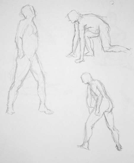
Getting back to drawing the figure
Since the Summer, Kiri and I haven't been able to attend figure drawing and painting classes at the New England Realist Art Center. She got too pregnant, then she had Brendan, who does make things more difficult.
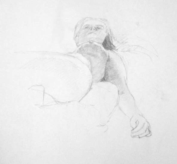
We have been attending sessions on Monday nights of the Worcester figure drawing group at Worcester State College (actually, we've been alternating weeks while the other one watches the kid). An open figure drawing session is very different. First, there's no instruction. Second, it's a lot cheaper. Third, poses run from one minute to fifteen minutes. At NERAC, poses run for four or five three hour sessions. So it's been a bit of an adjustment.
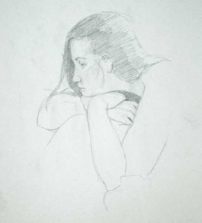
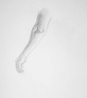
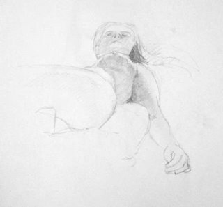
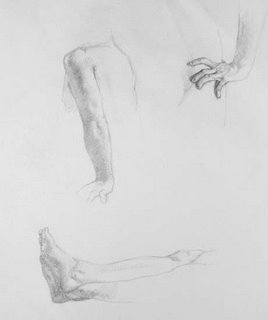
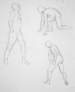
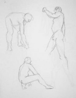
We have been attending sessions on Monday nights of the Worcester figure drawing group at Worcester State College (actually, we've been alternating weeks while the other one watches the kid). An open figure drawing session is very different. First, there's no instruction. Second, it's a lot cheaper. Third, poses run from one minute to fifteen minutes. At NERAC, poses run for four or five three hour sessions. So it's been a bit of an adjustment.



20 October 2006
Archival permanence
Over time, all paintings deteriorate. Badly made paintings deteriorate quickly, sometimes within a year or two of completion. A painting made with a high level of craftsmanship can last for many years before noticeable changes occur.
For most of us, it isn't worth going to extreme lengths to make our paintings as permanent as they can possibly be. You could, for example, choose to paint on high-tech aluminum honeycomb panels. These are light, long-lasting, and much better supports for painting than most of those used by artists, because they don't significantly expand or contract with changes in temperature and humidity. They also cost hundreds or thousands of dollars. If you know that you are a visionary artist who will be producing work of breathtaking magnificence that will be of incredible historic significance, you owe it to future generations to eat only cheap prepackaged noodle dishes at each meal so that you can afford to paint on the most permanent and expensive supports (until you work starts to sell for many thousands of dollars—then, go ahead and treat yourself to a nice juicy tofu burger).
For the rest of us, not so much. Most paintings by even fairly good artists won't be saved for much more than a generation. The best way to preserve your paintings is to make them really, really good (or really, really popular, which 20th century artists demonstrated to have no correlation with good). A painting that people like a lot will be hung on a wall in a room that has a reasonably constant temperature and no wild swings in humidity. Almost any painting will survive for a long time under those conditions. And if people really like it, it might hang in a museum or get restored by a conservator if it starts to show signs of wear and tear. If a painting isn't that great, then even if it's made with excellent crafstmanship and highly archival materials it's likey to be kept in the attic, basement, or garage for years at a time. Even well-made paintings won't last long under those circumstances, and when they start to fall apart, no one will pay for a conservator to fix them. So the most archival quality a painting can have is to be so well-liked that the owner (and the owner's heirs) could never imagine putting it in a moldy basement.
(Of course, if you are a very famous celebrity such as Sir Paul McCartney, your incredibly bad vanity paintings will be treasured and preserved for centuries. Go figure.)
Nevetheless, I think it's a smart to construct paintings with quality materials and good craftsmanship, if only so that customers won't complain until after you are dead. Here are some guidelines for oil painting. If you don't follow them perfectly, it won't cause your painting to explode. But the closer you adhere to them, the more likely your painting will be to last a long time under optimal conditions, or survive brief periods under poor conditions. If you want a painting to last a long time under poor conditions, oil paint is a very bad choice of medium.
Personally, I doubt that the art conservation robots in the Louvre in the year 2306 will curse my name because I used sub-standard methods requiring them to spend an extra 324.663 seconds fixing one of my paintings. But that would be really cool.
Update 10/23/06: One other point regarding how to construct paintings that will last. If you paint in multiple layers, make sure that each layer adheres to the one below it. A paint layer that is smooth and shiny is not a good surface for painting over, because the next layer of paint has no mechanical tooth to adhere to. You may want to scuff up the surface with a green kitchen scrubee pad or, if you prefer, wet sand. If you use a medium that contains a balsam such as Venice turpentine or Canada balsam, the paint will adhere better to the previous layer.
For most of us, it isn't worth going to extreme lengths to make our paintings as permanent as they can possibly be. You could, for example, choose to paint on high-tech aluminum honeycomb panels. These are light, long-lasting, and much better supports for painting than most of those used by artists, because they don't significantly expand or contract with changes in temperature and humidity. They also cost hundreds or thousands of dollars. If you know that you are a visionary artist who will be producing work of breathtaking magnificence that will be of incredible historic significance, you owe it to future generations to eat only cheap prepackaged noodle dishes at each meal so that you can afford to paint on the most permanent and expensive supports (until you work starts to sell for many thousands of dollars—then, go ahead and treat yourself to a nice juicy tofu burger).
For the rest of us, not so much. Most paintings by even fairly good artists won't be saved for much more than a generation. The best way to preserve your paintings is to make them really, really good (or really, really popular, which 20th century artists demonstrated to have no correlation with good). A painting that people like a lot will be hung on a wall in a room that has a reasonably constant temperature and no wild swings in humidity. Almost any painting will survive for a long time under those conditions. And if people really like it, it might hang in a museum or get restored by a conservator if it starts to show signs of wear and tear. If a painting isn't that great, then even if it's made with excellent crafstmanship and highly archival materials it's likey to be kept in the attic, basement, or garage for years at a time. Even well-made paintings won't last long under those circumstances, and when they start to fall apart, no one will pay for a conservator to fix them. So the most archival quality a painting can have is to be so well-liked that the owner (and the owner's heirs) could never imagine putting it in a moldy basement.
(Of course, if you are a very famous celebrity such as Sir Paul McCartney, your incredibly bad vanity paintings will be treasured and preserved for centuries. Go figure.)
Nevetheless, I think it's a smart to construct paintings with quality materials and good craftsmanship, if only so that customers won't complain until after you are dead. Here are some guidelines for oil painting. If you don't follow them perfectly, it won't cause your painting to explode. But the closer you adhere to them, the more likely your painting will be to last a long time under optimal conditions, or survive brief periods under poor conditions. If you want a painting to last a long time under poor conditions, oil paint is a very bad choice of medium.
- Rigid supports are better than fabric supports. Fabric is flexible, and every time it flexes (as it will do when temperature or humidity changes) the bond between the support and the paint is affected. Over time, that's very bad for a painting. Copper, steel, and aluminum panels are excellent supports for painting (although they can be heavy). Wood is OK only if it has been seasoned for a year or two after being cut and planed to size. Hardboard is probably OK if there is a good barrier between the panel and the paint. Tempered hardboard is stronger than untempered and that makes it better (despite what some sources say) even though there is a slight amount of oil in the surface of tempered hardboard. Medium density fiberboard is OK only if it is very well sealed on all sides against moisture.
- It may be that polyester will turn out to be the most archival fabric, because it is more dimensionally stable than organic fabrics like linen and cotton. We don’t know yet.
- Oil grounds are good to paint on. Lead grounds are the best oil grounds, because lead is a very flexible pigment. Acrylic primer ("gesso") is probably a decent ground to paint on (we'll know for sure in 100 years) but murder on brushes. Traditional gesso is probably an OK ground on a rigid support (the hide glue in gesso is very strong, which is good, but likes to absorb water, which is bad).
- Use permanent pigments. Alizarin crimson is not permanent, especially in mixtures and when applied very thinly. Impermanent pigments will fade or become dull over time.
- If you use linen, cotton, or hemp as a support, don't put paint or oil primer directly onto it. The oil will rot the fabric. You need a barrier, such as hide glue or acrylic primer, between the paint and the fabric. Make sure the barrier covers the sides as well as the front of the canvas.
- Don't apply a lot of thick paint. Thick, heavy layers of impasto are much less permanent than thin layers (about the thickness of a layer of house paint). Several thin layers (allowed to dry in between) are much more permanent than one thick layer. A few expressive blobs of impasto here and there are not going to cause problems, but large areas of thick paint are bad.
- Linseed forms the strongest paint film of the drying oils. Walnut is less strong. Safflower and poppy are weaker still. Because the same stuff that make the paint film strong also yellows, linseed will yellow more than other oils. But go for a walk through a museum with paintings three or four hundred years old. You probably don't find yourself thinking, “Wow! those paintings now suck because they've yellowed.” (Ignore Brown School paintings from the 17th and 18th centuries that were deliberately painted with an overall dull yellowish tone.) You can barely notice the yellowing, and those paintings were almost all done in linseed. Whites are a little warm, blues turn slightly greenish. That's how bad the yellowng gets on a well-made painting. It's barely noticeable, although some paint manufacturers will try to scare you into buying special “non-yellowing” paints made with oils that are less strong. Personally, I only use paints made with linseed and, to a lesser degree, walnut. I avoid paints made with poppy and safflower. If you do use safflower oil, be aware that the kind you can get in a grocery store is almost certainly not the kind that dries properly when mixed with oil paint.
- There are a number of good reasons to avoid student grade paint, but archival permanence is not one of them. Student grade paint from a good company will be as archival as their artist-grade paint.
- It is best to not add anything to your paint—no mediums, no solvents, no nothing. If you do add stuff to the paint, add only a little bit (less than 20% of paint volume). If you add solvents, don't make the paint watery or washy, just add enough to make the paint more manageable. If you apply a layer of medium to the surface of a dried layer of paint before you paint over it, make it a very thin layer.
- It is best not to add metallic driers to make the paint dry more quickly. If you do add them, I think that lead napthenate is best. Add a tiny amount (like one drop from a toothpick) to a penny-sized blob of paint on your palette. Add driers only to the slow-drying pigments on your palette.
- In my opinion, it has not yet been demonstrated whether alkyd painting mediums (Liquin, Galkyd, Neo-Meglip, and so on) are sufficiently permanent. They are probably fine for single layer, direct painting. I’ve heard a couple of complaints about delamination in multi-layered paintings that may be due to use of alkyds. Some alkyd mediums can also yellow quite a bit. Personally, I don’t see any reason to paint with anything that smells like that.
- If you add solvents and oils to your paint, and you work in layers, it’s best to follow the fat over lean rule. That just means that no layer should have less oil in it than the layer beneath it. So be careful about how you use mediums and avoid painting large areas of lean paints (without much oil in them) like manganese violet over large areas of fat paints (with a lot of oil in them) like ivory black. The fat over lean rule is especially important if you paint in thick layers. In thin layers, it’s still a good idea, but less crucial.
- Varnish the painting after it is dry. By dry, I mean three months to a year after completion, depending on how thick the paint is.
Personally, I doubt that the art conservation robots in the Louvre in the year 2306 will curse my name because I used sub-standard methods requiring them to spend an extra 324.663 seconds fixing one of my paintings. But that would be really cool.
Update 10/23/06: One other point regarding how to construct paintings that will last. If you paint in multiple layers, make sure that each layer adheres to the one below it. A paint layer that is smooth and shiny is not a good surface for painting over, because the next layer of paint has no mechanical tooth to adhere to. You may want to scuff up the surface with a green kitchen scrubee pad or, if you prefer, wet sand. If you use a medium that contains a balsam such as Venice turpentine or Canada balsam, the paint will adhere better to the previous layer.
Subscribe to:
Posts (Atom)
