29 November 2006
When I'm painting, I wear a painting shirt that's got lots of paint on it. I often just wipe my brush on the shirt rather than using a rag—after all, the shirt is very conveniently located for wiping while painting. That works great, except when I start painting without remembering to change into my painting shirt...
26 November 2006
Light for the Artist 2
Another quote from Ted Seth Jacobs.
Geometric and Organic Shapes. There is a radical difference between shapes of things made by nature and those manufactured by man. Although nature is capable of producing some startlingly geometric forms, most living creatures, and especially we humans, are irregularly shaped. Our shapes are adapted to carry out specific functions. Unfortunately, many books about how to paint and draw present the human form as a collection of simplified geometric shapes. For example, the head may be described as an egg shape, or the eyes as spheres, along with many squarish planes and slices, cubes and cylinders. It is important to remember that none of these abstract geometric forms exists on the body. Humans are human-shaped.
25 November 2006
Leyendecker
Here's a great page of studies by the great American illustrator J. C. Leyendecker (you know, the guy who invented the modern image of Santa Claus), showing how he developed his compositions.
H/T: Charley Parker.
H/T: Charley Parker.
Light for the Artist 1
"Light for the Artist," by Ted Seth Jacobs, is out of print. I strongly recommend that any artist who wants to work in a realist mode, rather than one that is symbolic or abstract, attempt to find a copy. There is no other book like it. I can find something worth quoting on almost every page, so I will do so from time to time.
A Word About Half-Tones. If we consider that light travels in beams, it is impossible to conceive logically of a plane that is not facing either toward or away from those rays. Although some parts of an object face more and some less directly into the light, I cannot conceive of an object that is turned neither away nor toward the source. I cannot imagine a mysterious angle or plane that lies somehow between light and shadow. Probably what is meant by "half-tones" is what I call the darker lights, that is, those surfaces still receiving some light but not turned very directly into its path. The semantic distinction is important because the concept behind the idea of a half-tint tends to produce excessively soft and indecisive work. [Emphasis his.]And this:
Imagine, for example, that we are painting an interior scene where the light enters through a window on the left. Now, imagine that we draw one chair near that window and place another much farther away from the light. If we paint the same intensity of light on both chairs, it will be as if they both occupied the same position or were at the same distance from the window. There would be an anomaly, or contradiction, in our painted room that would produce an unconvincing suggestion of space. The drawing would suggest that our chairs were in different parts of the room, while the amount of light, or value, would suggest that they were both in the same place. Our painted room would not seem "real" because it would not be consistent with what we are accustomed to seeing. Our painted space would seem visually distorted. It is crucial for the value to be in perfect alignment with the spacial placement. Value and drawing must be in a logical relation. At every point, the light's value represents a spatial value. Like a symphony conductor, we must orchestrate our notes, or values, harmoniously in relation to the position of the light source. Our pictorial space will then sing true.As of this writing, Alibris has a copy that they want $127.45 for. If you can't afford it at that price, then look other places and keep checking. It's worth your effort.
22 November 2006
Tad Spurgeon
has a lot to say about oil painting. He has a basic guide to painting, a lot of info on working with traditional oil painting materials, and a gallery of his own work.
Check out his site.
Check out his site.
Leaves
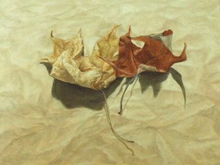 I've been working on this one for a couple of weeks. I don't think it's quite successful, for two reasons. First, in the leaves I kind of got too stuck on fiddly details before I established the large masses, and that affects their dimensionality, especially on the left one. Second, the composition deviates from the still life convention of basically depicting some objects in a box, looking at them against a vertical backdrop. In this composition, you are looking down toward two objects on a flat piece of crumpled brown paper. That would be easier if I hadn't chosen to light them from behind. I thought I could make the perspective work with the shape of the shadows, with the graded lighting (dark to light, front to back) and with receding perspective in the texture of the paper. While I think I did OK, I'm really not quite happy with it. I like deviating from still life compositional conventions, but they are conventions because they work. I'm still learning which rules I have to follow and which I can get away with playing around with.
It's painted on an ABS (styrene) panel, a new product from Real Gesso. I found it really nice to paint on in oils, with just the right grab and absorbency. Full disclosure: they sent this one to me as a free sample, but I am sure that I will be buying some. If you are tired of pre-primed canvases but don't want to have to make your own painting supports, these are a good choice.
The Zone
The zone is the place where you just draw, just paint, and all of your conscious thoughts are focused on making the art happen. The zone can be a hard place to get to, because thoughts continuously intrude. I worry about how other people will perceive the work instead of how to make it right. That's especially the case when I'm in an art class or figure drawing session, where it's easy to start feeling like either (a) everyone else knows what they are doing and you don't; or (b) you are the master and their work is completely lame. Either of those attitudes takes you away from the work, and away from the zone. When you are in the zone, any comparison to other work is irrelevant.
When I start to work on drawing or painting, the first thing I try to consciously do is leave ego and performance anxiety behind. The art comes from someplace else, so there isn't any reason to worry and there is no reason to feel superior. It is what it is. If I make something that sucks, then that's where I'm at today and I need to work through it and learn from my mistakes. If I'm on top of the world today and everything is working, then focusing on anything else but just doing the work will take me away from making good art. It's a similar feeling to martial arts, in which there are times when you are completely in your body, know absolutely where you are and where your opponent is, and can watch in a sort of detached way as a match progresses and your body does what it needs to do. With practice, it becomes easier to know what it feels like to be in the zone and create the mental preconditions that allow that to happen again.
When I start to work on drawing or painting, the first thing I try to consciously do is leave ego and performance anxiety behind. The art comes from someplace else, so there isn't any reason to worry and there is no reason to feel superior. It is what it is. If I make something that sucks, then that's where I'm at today and I need to work through it and learn from my mistakes. If I'm on top of the world today and everything is working, then focusing on anything else but just doing the work will take me away from making good art. It's a similar feeling to martial arts, in which there are times when you are completely in your body, know absolutely where you are and where your opponent is, and can watch in a sort of detached way as a match progresses and your body does what it needs to do. With practice, it becomes easier to know what it feels like to be in the zone and create the mental preconditions that allow that to happen again.
Edges
I'm just beginning to understand the use of edge control in painting. Edges are important in part because they are such an important part of the brain's visual processing system. You have cells in your optic nerve that do nothing but respond when they detect a sharp transition from one tone to another. Without sophisticated edge processing algorithms built into your visual cortex, the world would be a confusing, blurry jumble. The reason why we respond so strongly to line drawings, even though line doesn't really exist like that in nature, is precisely because our brains are designed to interpret edges—sharp tonal transitions—as if they were the prime determinant of three dimensional space.
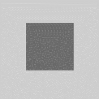
You can see this processing system at work. Take a look at the inside and outside edges of the dark gray square. Around the outside of the dark shape, you can see a slight halo of lighter gray. Inside the dark square, you can see a slightly darker gray. That's not what's actually there—it's the lower levels of your optic nerve saying "I found an edge! I found an edge! It's right here!"
Photographers control edges through the manipulation of focus. The subject of the photo is generally in focus, with hard edges, while the rest of the photo may be blurred and out of focus. That mimics the way your eye works. At any given time, only the very center of your visual field is clear. In part that's because your eye, like a camera lens, can only focus at one distance at a time. But more importantly, only the very center part of your retina—the fovea—has a high density of visual receptor cells. Only foveal vision has any degree of detail; the rest is just a vague blur. You are generally not aware of how tiny your window of detailed vision is, because your brain hides that annoying detail from you. You naturally move your eye around whatever you are looking at, and your brain pieces together an internal conceptual image in which you have the illusion of seeing, at any given moment, a far larger region of detailed information than your eyes are actually delivering to you. In fact, you can't choose not to move your eyes around—even though you may be staring at one spot, there is a slight movement of your eye muscles.
The strongest signal of what is in focus, and what is within foveal vision, is the hard edge. Outside of the eye's focal point, and outside of foveal vision, all edges are blurred. Within that zone, any edges that have a strong value transition are emphasized and used by the visual system to develop a conceptual model of three-dimensional visual space.
Painters have the ability to control the sharpness of any edge they wish. An edge can be sharp, completely blurred, or somewhere in between. Over the course of it's length, you can make an edge change from hard to soft and back to hard again. You can also "lose" an edge by having it blend into it's background, present only by inference. The systematic use of hard, soft, and lost edges is a powerful tool for composition and control of the viewer's eye. Because the eye is attracted by hard edges, you can enhance the hardness of whatever you want the viewer to look at more. You can make visual pathways of hard edges that define how the eye enters and moves around the composition. You can suggest shape by making receding edges softer. You can create a sense of mystery and visual engagement by hiding some edges, requiring the viewer to participate in the process of creating the picture by creating edges where you haven't actually painted them.
Prior to the development of the Venetian style of painting in the early 16th century (Bellini, Giorgione, Titian), edges were usually painted hard, except where soft transitions were required to represent soft forms, forms in shadow, forms in the distance, or turning edges. The Venetian school painters (and all of the vast number of artist influenced by them, such as Rembrandt, Rubens, Velázquez, and just about everyone since then) developed ways to use edges as a compositional device. If you paint all edges except those around your focal point as soft, then the eye is naturally drawn to that area. If you paint objects that are closer to the viewer as having harder edges, then those objects appear closer and you effectively define the three-dimensional space of the picture. If you paint a variety of hard, soft, and lost edges, you increase the complexity of the painting and invite the viewer to explore the composition.
Someday, I'll be able to make all that work in my compositions without effort. In the meantime, it helps to understand the theory, study paintings that use edges effectively (such as those by Ingres), and become more conscious of how I use edges in composition.
You can see this processing system at work. Take a look at the inside and outside edges of the dark gray square. Around the outside of the dark shape, you can see a slight halo of lighter gray. Inside the dark square, you can see a slightly darker gray. That's not what's actually there—it's the lower levels of your optic nerve saying "I found an edge! I found an edge! It's right here!"

Photographers control edges through the manipulation of focus. The subject of the photo is generally in focus, with hard edges, while the rest of the photo may be blurred and out of focus. That mimics the way your eye works. At any given time, only the very center of your visual field is clear. In part that's because your eye, like a camera lens, can only focus at one distance at a time. But more importantly, only the very center part of your retina—the fovea—has a high density of visual receptor cells. Only foveal vision has any degree of detail; the rest is just a vague blur. You are generally not aware of how tiny your window of detailed vision is, because your brain hides that annoying detail from you. You naturally move your eye around whatever you are looking at, and your brain pieces together an internal conceptual image in which you have the illusion of seeing, at any given moment, a far larger region of detailed information than your eyes are actually delivering to you. In fact, you can't choose not to move your eyes around—even though you may be staring at one spot, there is a slight movement of your eye muscles.
The strongest signal of what is in focus, and what is within foveal vision, is the hard edge. Outside of the eye's focal point, and outside of foveal vision, all edges are blurred. Within that zone, any edges that have a strong value transition are emphasized and used by the visual system to develop a conceptual model of three-dimensional visual space.
Painters have the ability to control the sharpness of any edge they wish. An edge can be sharp, completely blurred, or somewhere in between. Over the course of it's length, you can make an edge change from hard to soft and back to hard again. You can also "lose" an edge by having it blend into it's background, present only by inference. The systematic use of hard, soft, and lost edges is a powerful tool for composition and control of the viewer's eye. Because the eye is attracted by hard edges, you can enhance the hardness of whatever you want the viewer to look at more. You can make visual pathways of hard edges that define how the eye enters and moves around the composition. You can suggest shape by making receding edges softer. You can create a sense of mystery and visual engagement by hiding some edges, requiring the viewer to participate in the process of creating the picture by creating edges where you haven't actually painted them.
Prior to the development of the Venetian style of painting in the early 16th century (Bellini, Giorgione, Titian), edges were usually painted hard, except where soft transitions were required to represent soft forms, forms in shadow, forms in the distance, or turning edges. The Venetian school painters (and all of the vast number of artist influenced by them, such as Rembrandt, Rubens, Velázquez, and just about everyone since then) developed ways to use edges as a compositional device. If you paint all edges except those around your focal point as soft, then the eye is naturally drawn to that area. If you paint objects that are closer to the viewer as having harder edges, then those objects appear closer and you effectively define the three-dimensional space of the picture. If you paint a variety of hard, soft, and lost edges, you increase the complexity of the painting and invite the viewer to explore the composition.
Someday, I'll be able to make all that work in my compositions without effort. In the meantime, it helps to understand the theory, study paintings that use edges effectively (such as those by Ingres), and become more conscious of how I use edges in composition.
16 November 2006
Payne's grey
is usually a convenience mixture of a black and one or two other colors that creates a cool dark grey. I don't find paints like that useful, because I can so easily mix them myself. On one or two occasions, I've encountered someone in an online art forum who avoids black because it is a "dead color," but uses Payne's grey. How is that different from having black on your palette?
Another good one is King's Blue, which usually a mixture of pthalo or ultramarine blue and white. What exactly is the point?
I try to pay attention to which pigments are in the paints I buy. I have a few multi-pigment paints left over from before I got more focused on color, and I still use those from time to time. But for the most part I stick with single-pigment paints. They provide more flexibility and a higher maximum chroma (because mixing paints reduces chroma). I also much prefer to work with and understand the individual character of particular pigments, which is something I can't do with convenience mixtures.
14 November 2006
Some more thoughts on egg tempera
"Tempera isn't hard. It's just slow."I've been playing a bit more with egg tempera lately, and remembering why I like it so much. I can understand why tempera went largely out of fashion in the 16th century: oil paint has a greater value range (because oil darks are darker than tempera darks), so much can be done with blending in oil, and oil paint is perhaps more resistant to damage (although tempera doesn't crack and yellow as oil does).
—George Tooker
Tempera, however, has its own properties to recommend it.
- Many colors have more chroma and delicacy in tempera than in oil. Ultramarine blue, for example, is lighter and more saturated in tempera than in oil—it's like a different color. Earth pigments have a clarity and vibrancy that they do not have in oil. And earths that are barely distinguishable from each other in oil paint have very distinctive characters in tempera. Siennas, red ochres, yellow ochres, golden ochres, green umbers, red umbers, burnt siennas, hematites, malachites, and so many other earths have properties that cannot be fully explored in oil paint, but which really come into their own when tempered with egg yolk.
- In tempera, pigments do not loose as much chroma when mixed with white or black as they do in oil. Tints are less chalky and shades are less dull. In tempera, you can work with higher chroma without looking garish the way really intense oil paints do. That helps to compensate for the reduced value range and gives tempera paintings a sense of delicacy and refinement without dullness.
- In oil paint, you can glaze, scumble, and partially mix multiple colors to achieve interesting optical mixtures. In tempera, the closest you can come to that is the petit lac technique common in Greek and Russian icon painting: you put a wet puddle on a panel that is horizontal and use the brush to very gently spread the paint without breaking the surface tension. That results in interesting, slightly mottled surface effects. In tempera, you can also use layer after layer of crosshatching, weaving colors across and over each other, to produce subtle optical effects.
If you have an interest in egg tempera, I can't recommend "The Practice of Tempera Painting" by Daniel V. Thompson highly enough. It covers the preparation of supports and grounds, choosing and working with pigments, doing underdrawings, application of paint, and gilding. I would only note that (a) you don't really have to grind modern pigments with a muller and slab; you can just put them in a jar with water and shake; (b) his list of pigments is a little dated; and (c) we now know that Italian tempera painters did not use a detailed underdrawing as a critical component of the development of a painting's value scale. Other than those details, the information in the book is as useful today as it was when the second edition was published in 1962.
08 November 2006
You say "sfumah-to," I say "sfumay-to"
In the excellent Giotto to Dürer: Early Renaissance Painting in the National Gallery, there is a description of the painting technique Leonardo used for most of his later work, including the Mona Lisa. This technique, which he called sfumato ("smoke-like"), creates a sense of three-dimensional light and shade that is different from that of his contemporaries.
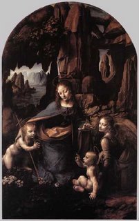
I have seen references that said that the sfumato technique was simply to blend with the fingers. Leonardo certainly did that, but you can find fingerprints in oil paintings from before his birth, so finger painting is hardly unique to his style. Instead, it is based on his observations of smoke. He observed that smoke. which is semi-opaque, looks white against a dark background and dark against a light background. So he decided to make use of the optical properties of lead white paint in a similar manner. He would begin by applying a very dark underpainting in black, earth tones, and possibly a transparent bituminous brown. This underpainting was rather loose and thin, probably diluted with naphtha or oil of spike lavender (almost no other 15th century painters appear to have used solvents for painting, so Leonardo is probably the inventor of the washy underpainting). He would then apply scumbles and glazes over the dark underpainting in muted colors mixed with white. The method produces smoky, opalescent transitions from dark to light that are quite beautiful and quite unlike other painting in that period.
By the way, I want this Da Vinci t-shirt.
Never use a brush smaller than your head
Once piece of oil painting conventional wisdom goes along the lines of "find a brush size you are comfortable with, then get a larger brush and use that." The idea is that larger brushes help you to paint in large abstract masses rather than getting stuck on fiddly little details.
For my part, I tried using larger brushes than I felt comfortable with for some time. I felt like I was trying to paint with a cat. After a couple of months, it wasn't any better. So I got some smaller brushes, and finally felt like I could control the paint. Although it's important to understand the need to see the big picture and work from larger to smaller, my advice is to not take that principle to an extreme. If a big brush is helpful, then use that. If smaller brushes let you get the job done more effectively, then use those. Often, it's a good idea to work from larger brushes to smaller ones as the painting progresses, but don't drive yourself nuts with a brush you can't control.
For my part, I tried using larger brushes than I felt comfortable with for some time. I felt like I was trying to paint with a cat. After a couple of months, it wasn't any better. So I got some smaller brushes, and finally felt like I could control the paint. Although it's important to understand the need to see the big picture and work from larger to smaller, my advice is to not take that principle to an extreme. If a big brush is helpful, then use that. If smaller brushes let you get the job done more effectively, then use those. Often, it's a good idea to work from larger brushes to smaller ones as the painting progresses, but don't drive yourself nuts with a brush you can't control.
07 November 2006
Egg tempera
is a type of paint made by mixing pigment with egg yolk.* This week I've been working on an egg tempera study (several figures copied from paintings by Fra Angelico), to use as a demo piece for the Renaissance painting workshop I'm doing at Wetcanvas and for an egg tempera class my wife and I will be teaching at a Society for Creative Anachronism event this Saturday.
I hadn't done much tempera in the last year. I forgot what a beautiful medium it is. The painting process is to apply many fine hatching strokes with a dry brush, building up value slowly in a manner similar to working with a graphite pencil. The result is unlike any other medium. At first it's frustrating, because I make a lot of little mistakes. Drat! I have too much paint on the brush. Akk! There's still too much paint. Gah! I'm painting over an area that's still wet and the paint is coming up. If you are trying to build tone, you gradually weave strokes back and forth, back and forth. You get into a kind of mental zone and suddenly it looks exactly right.
I need to do more tempera painting.
*If you are unfamiliar with painting media, please don't confuse egg tempera with "tempera" poster paints for children. Other than being kinds of paint, they have nothing at all to do with each other.
01 November 2006
I did a lot of complaining about bad use of chroma
in my last post. I was grousing about artists who use high chroma colors indiscriminately. So I thought I'd provide an example of a good painting with lots of intense color.
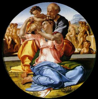
This is the Doni Tondo by Michelangelo. Notice the bright colors in the drapery, which dominate the painting. Yet Michelangelo has carefully provided rests of dark dull colors and lighter tints. He uses chroma brilliantly.
So I don't have a problem with high chroma, just clueless chroma.
It's called the "Doni Tondo," by the way, because it was commissioned for the daughter of a guy whose last name was Doni. A tondo, of course, is a round painting. It was painted circa 1506, when Michelangelo was 31 years old.
Subscribe to:
Posts (Atom)
