 Another photo of Carrowmore in County Sligo, Ireland. The rock is a 5,000 year old gravestone.
31 July 2006
Barrow
Another photo of Carrowmore in County Sligo, Ireland. The rock is a 5,000 year old gravestone.
30 July 2006
The Flemish method

There are several current painting methods whose practitioners claim that they are working just like early Flemish painters did. In the early 1400's, Flemish and Netherlandish painters (Jan van Eyck, Robert Campin, Rogier van der Weyden, and so on) invented oil painting as it is practiced today. In the 19th and early 20th centuries, art historians spent a lot of time speculating about how the first oil painters practiced their art. Unfortunately, they could only look at paintings and read old manuscripts. As it turns out, looking at paintings doesn't tell you a whole lot about the methods by which they were made. And the early oil painters didn't, so far as we know, write down their valuable trade secrets for scholars hundereds of years later to study.
So most of what you will see about "Flemish" painting methods, although sometimes used by very skilled artists, is basically what some 19th century German academics erroneously thought Northern European painting was. There is one school that alternates layers of egg-oil emulsion white with layers of oil glazes in primary colors. Another school calls for each painting to be made in seven layers, each of which dries for seven weeks (are we artists or numerologists?).
The reason why people are so fascinated by early Flemish paintings is that they are so remarkable. First, although they are very, very old, they are often in much better shape than oil paintings that are hundreds of years younger (many early 20th century paintings have deteriorated more than paintings from the 15th century). Second, the paintings glow with a sense of vitality that is seldom seen in more recent paintings. They have a quality that is often described as "jewel-like." This is especially evident if you see them in person; it's easy to pick out the Flemish paintings from those done in other periods, or those from the same period done in other places. The precise detail and gorgeous colors are marvelous to look at.
The thing is, we now know a lot more about early Flemish painting methods than we used to, because modern technical analysis provides a lot more information. So I can, with reasonable authority, describe actual "Flemish" painting methods, which were generally much simpler than those taught in special classes where the "Secrets of the Old Masters" are revealed.
The Northern European paintings we have are almost entirely done on panel, not because canvas wasn't used, but because panel paintings are the ones that have lasted. The panels were made of local hardwoods such as oak. They are often quite small; the large ones were made with several planks fastened together. The panels were planed to a smooth finish and then seasoned (usually for several years). They were then coated in hide glue, which is a gelatin that becomes liquid when heated. Then an initial priming was applied that consisted of warm hide glue mixed with chalk (calcium carbonate). This priming was applied in several layers, allowed to dry, then sanded or scraped smooth. The modern word for a priming layer like this is "gesso," although technically gesso was the Italian version, made from hide glue mixed with gypsum (calcium sulfate). Modern acrylic primer is often labelled "gesso," but that's totally incorrect. Anyone caught referring to acrylic primer as gesso will be required to stay after school and write "gesso is not made with plastic" 1000 times on the chalkboard.
There were very few pigments available at the time to make paint with, although that limitation is not obvious from looking at old master paintings. The available colors included ultramarine blue (very expensive as it had to be imported from Afghanistan and then laboriously refined), azurite blue (sort of like a cobalt blue), red lake (similar to alizarin crimson), lead tin yellow (similar to Naples yellow), vermillion (similar to cadmium red), bone black (similar to what is now, incorrectly, called "ivory" black), flake white, copper green (similar to viridian), and various earth colors (similar to modern ochres, siennas, and green earths). Paint was made by hand, usually that morning or the day before, by apprentices and studio assistants. If you haven't tried oil paint made fresh by hand, it is more fluid than the stuff you get today in tubes.
In the early 15th century, oil painters probably didn't use solvents such as spirits of turpentine or oil of spike. This demostrates that it is quite possible to apply oil paint with very fine precision without having to thin it down. It's easier to do this kind of work with handmade paint than with tube oil colors.
This method involves multiple layers that are allowed to dry in between applications. In some cases, lower layers were done in egg tempera, switching to oil later on in the sequence. Flesh tones were painted very thinly, in one or two layers. The modern oil painting approach (mostly developed in Florence in the early 16th century) emphasizes thin, transparent darks and thick, opaque lights. By comparison, early Northern European painting was primarily a glazing method in which darks were established with thick layers of transparent paint. This allows the darks to have a sense of depth and color that is not possible in direct (single layer) painting. Glazing is typically done over a layer of opaque paint of similar color; red lake over vermillion, for example. Black, since it tends to produce dull mixtures, is not used except to darken earth colors (most artists think that the idea of avoiding black was invented by the impressionists, but no). Instead, darks are created by thick glazes and by what we would today recognize as complimentary color mixtures (red lake could be darkened with ultramarine, for example).
Here's one possible reconstruction of the painting sequence:
- Make a detailed drawing on paper and transfer it to a gessoed panel. Reinforce and elaborate the drawing with ink or dark paint. Northern European artists usually made very detailed underdrawings.
- The initial layer of paint, called the primuersel, is used to define the dark areas of the painting. The primuersel color is made by mixing black with earth tones such as red or yellow ochre; it is therefore similar to the verdaccio used for flesh tones in the traditional Italian egg tempera method (but without a green earth underpainting and not just in flesh tones). This layer was probably often done in egg tempera or tempera grassa. Either way, this layer should be used to define form, edges, shadows, and other darks throughout the painting.
- Now apply the basic colors to each area of the painting, starting to work up modeling of forms with opaque colors but avoiding fine detail. This stage is called “dead coloring.” As with primuersel, some artists used egg tempera or tempera grassa for this layer. Flesh tones can be begun with mixed tones using appropriate brown or pink mixtures of white, vermillion, and earth colors. In light areas, keep the paint as thin as you can; you want the white of the gesso to show through. X-ray scans show that lead white was often used only to emphasize the brightest highlights of flesh tones, with a very thin toning of the gesso used for most light areas of flesh. This approach keeps light areas bright and avoids later yellowing by minimizing the amount of oil. In shadow areas, don’t worry so much about paint thickness, but keep the surface of the paint smooth. In areas that will later be glazed, keep light areas lighter than the intended final effect, since glazes will darken what they cover. When you have taken this stage as far as you can, let the paint dry once again.
- If you began the painting in egg tempera or tempera grassa, you will switch to pure oil paint no later than when dead coloring is completed. Use paints ground in linseed oil. When switching from tempera to oil paint, you may choose to apply a very thin layer of oil to prevent excessive absorption by the tempera underlayers. From now on, you will let each layer dry thoroughly before further painting. If the layers are thin, this will take up to several days each time, depending on the pigments you use and whether the paint contains siccatives. It may be helpful to wet sand in between layers as needed to maintain a surface that is thin and smooth.
- You will now work each area of the painting toward the intended final finish. Where desired, you can either thin the paint slightly with medium (oil mixed with a varnish or balsam) or put a very thin layer of medium onto the surface and paint onto that. Apply fine detail to light areas. Areas of dark or bright colors, especially those around the main areas of interest, can be glazed. So, for example, a red robe, after a primuersel of black mixed with red ochre and then initial opaque modeling with vermillion and white, could then be glazed with a transparent red lake, using fingers, a rag, or a soft brush to make the glaze very thin over the lights and thicker over the darks. A little ultramarine or indigo could be glazed in to neutralize and reinforce the darker shadows. Multiple glazes can be applied (allow the paint to dry and wet sand in between layers) until a clear sense of three-dimensional depth has been achieved, generally with inky darks, intense midtones, and bright lights. This process can be very time consuming, especially if you are not using siccatives, but it produces a striking effect that is immediately noticeable when comparing Flemish oil paintings to other work of the period.
- The final stages would be used primarily for detail work and to apply thin scumbles of opaque color mixed with white where needed over lighter areas of glazed color. Again, sand between coats. It is possible that some fine details were applied with egg tempera, worked into wet oil paint. This development of detail would continue until a very high degree of finish was obtained.

29 July 2006
The Online Photographer
Is a lovely photography blog by MIke Johnston. He has great taste in photography, unencumbered by rules that say what a good photo or a good composition is supposed to be. He's incredibly knowledgeable about photography without being a pedantic techie. And he has strong, cranky opinions that are always worth reading and considering.
The Online Photographer
The Online Photographer
27 July 2006
Whites
For practical painting purposes, there are three white pigments. It's useful to know their properties, because they each have their uses.
Lead white (aka flake white, cremnitz white, ceruse) is the traditional white that's been in use since ancient times. It is basic lead carbonate (older versions of the pigment had some other lead compounds mixed in).
For the most part, lead white is available only in oil paint. It is of moderate opacity and has a slightly warm tone. Lead white forms a flexible and permanent paint film. In oil paint it dries very quickly. I find that lead white makes a great general mixing white, less overpowering than titanium and with more strength than zinc. Some people are afraid of lead white because they've heard so many bad things on the news about lead house paint. The problems that occur with leaded house paint are not relevant to painting unless you plan to allow children to eat your paintings (something I would strongly caution against). Lead white is, in fact, a bad thing to ingest (especially for kids) and anyone using it should be careful. But it isn't radioactive and it doesn't penetrate skin, so a few simple precautions (which should be used when painting no matter what pigments you work with) are what's needed to be safe with lead white artist's paint.
Over hundreds of years, lead white becomes more transparent. This transparency is the reason why you can often see the ghostly images of changes the artist made as the painting developed (these are called pentimenti—"repentances"). It is also why early Renaissance Italian egg tempera paintins often have green flesh tones. The usual procedure was to paint flesh areas with green earth, followed by a mixed dark dull tone called a verdaccio, followed by red on the parts of the face that have lots of blood, such as cheeks, ears, and the nose. After that, a pink made from lead white mixed with vermillion was applied. As the lead white becomes more transparent, the green and red underlayers are revealed. Modern painters who like to use lead white (and perhaps vainly think that their work will be treasured for hundreds of years) often use mixtures of lead and zinc or titanium to mitigate this transparency effect.
Titanium white is the strongest available white pigment. It is very opaque and slightly cool in tone. Because it is such a strong tinter, titanium can be hard to work with, particularly with darker colors. They become "chalky," losing their chroma rapidly with the addition of even a little titanium white. There are ways to compensate for this, but I generally use titanium white only when I really need heavy duty opacity. Titanium is a slow dryer in oil, which is usually another strike against it in my book, since I like to paint in layers.
Zinc white is the least opaque white of the available pigments. That makes it great for delicate value adjustments, especially with dark colors that are easily thrown off by just a tad too much white. It's also good for glazing or scumbling in multi-layered painting approaches in which underlayers are allowed to show through upper layers. In watercolor and gouache, zinc white is sometimes labelled "Chinese white." In acrylic, it's sometimes called "mixing white."
Mixes of these colors can be useful. For example, Williamsburg makes an excellent titanium-zinc blend that's opaque but less overpowering than pure titanium. Doak's flake #1c is a lead white and zinc blend that is great as a general mixing white (and less likely to suffer from eventual transparency than pure flake). I often have both of these on my palette.
In egg tempera, I often use a 50/50 blend of titanium and zinc. This gives an effect similar to lead white, without having to deal with toxic pigment in powder form. The smallest addition of yellow ochre gives it the warm tone of lead white as well.
Neactan
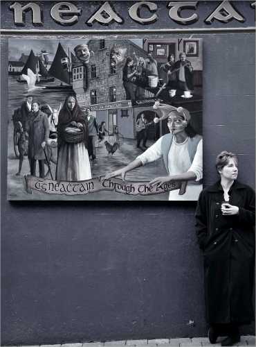 This is my wife Kirsten in Gallway, Ireland (on our honeymoon). Anyone care to translate the text from Irish?
26 July 2006
25 July 2006
I know that all of my readers are deeply interested in pigments
I mean, who wouldn't be? Pigments, of course, are the colored powders that give paints their, ur, their color. Without pigments, paintings wouldn't look like much. Cars, houses, and billboards would be pretty boring to look at as well.
One good, easy to digest reference on the web is the Pigments Through the Ages site. It is simple and easy to navigate. While not exhaustive, it reviews a range of historical (and some modern) pigments. It discusses their history, tells where (if natural) they are found or how (if manufactured) they are made, shows how they are made or processed, provides information about their chemical makeup, and so on. It doesn't cover as many pigments as I would like, and it leaves out some detail, but I'm an art geek. If you just want to browse through and get some interesting information, this is a nice little site.
One good, easy to digest reference on the web is the Pigments Through the Ages site. It is simple and easy to navigate. While not exhaustive, it reviews a range of historical (and some modern) pigments. It discusses their history, tells where (if natural) they are found or how (if manufactured) they are made, shows how they are made or processed, provides information about their chemical makeup, and so on. It doesn't cover as many pigments as I would like, and it leaves out some detail, but I'm an art geek. If you just want to browse through and get some interesting information, this is a nice little site.
23 July 2006
The burren
 is that big layered hill in the background. It is an enormous rock formation, with an ecosystem that includes plants found nowhere else. The photo is from County Clare, Ireland.
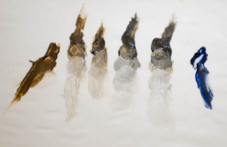
Complimentary mixing pairs: cadmium red and cadmium green
These two colors neutralize to make a series of useful gray-browns. Cadmium green is not, of course, a pigment. Instead, paint tubes labeled cad green are usually a convenience mixture of cadmium yellow and pthalo blue. I like the version made by Williamsburg. It's a useful yellow green that's strongly chromatic, but not overpowering the way pthalo green is, for example. You can mix it yourself, of course. In the sample above, the red is cadmium red medium, by Doak. In mixing, the cadmium red is stronger than the green, so you need more green than red to make a neutral hue.
Although I have more recently been working with an earth palette, I have used cad red + cad green as the basis for flesh tones in a number of figure paintings. Mixed with white, you can create a string of useful caucasian flesh colors. A little extra green makes for good shadows (depending on the light), while a little more red is good for people who have a tan or are naturally more ruddy. But it's especially good for people with pale complexions, since you can get a good low chroma orange-brown that looks just right for that purpose.
22 July 2006
Complimentary mixing pairs: raw sienna and ultramarine blue
This is the first in a series of posts, each of which will discuss one useful pair of complimentary colors. If you're not familiar with art terms, "complimentary" in this case doesn't refer to saying nice things about each other, but colors on opposite sides of the color wheel. Complimentary pairs of colors are useful because they typically mix to create neutral and near neutral colors. Since most of nature is composed of neutrals, any painter who is interested in subtlety instead of LOOK AT MY BRIGHT BRIGHT COLORS! needs to learn about working with neutrals. (Not that there isn't a place for high-chroma colors, but I think they are best used with restraint.)
 My favorite complimentary mixing pair is raw sienna and ultramarine blue. With them, you can mix a lovely range of cool blues, warm browns, and neutral greys. These colors don't call undue attention to themselves, but they harmonize well with each other and with a wide range of other pigments. It's a valuable exercise to do a whole painting with just these two colors and white; you'll be amazed at how much you can do with them. I've done lots of paintings in which those two colors predominate, staying in the background and setting the stage to allow other, brighter colors to stand out beautifully. Since both of them vary a bit from manufacturer to manufacturer, it's worth comparing a few of each with each other. At the moment, in oil, I use Williamsburg Italian raw sienna and Studio Products ultramarine. They mix very well together.
Update: Williamsburg also sells their Italian raw sienna as a pigment; it's the nicest raw sienna I've seen.
This book
What Painting Is, by James Elkins, is kind of odd. The book is all about one metaphor, explored in great detail. Elkins wants us to understand that painting and alchemy are the same. I must admit that he gets off to a great start. He's an art history academic who was once a practicing artist, and he is inspiring in his ability to describe the obsessive, seductive, overwhelming fascination of playing with colored mud. From the Introduction:
For the rest of the book.
It doesn't take too long before the metaphor starts to get strained. We learn a lot about the different processes of classical alchemy and the bizarre ways that alchemists thought about them. For each process, Elkins comes up with a (usually) strained comparison to how painters work with their materials. If I happened to be deeply interested in the practice of alchemy (both historical and modern) as well as painting, I'm sure that I would have had lots of "eureka" moments as I read this. But even though I am fascinated by painting and sort of interested in wierd and arcane bits of history, Elkins lost me somewhere around the middle of the book as it became clear that his metaphor was all he had. It's just not quite enough to justify a whole book.
And what's really painful is that I'm sure Elkins felt like he was leaving a lot out. This is an interesting and quirky essay, stretched into a short-ish book, that wishes it was a really long book, with a whole lot more footnotes.
In other words, Elkins is even more of an art geek than I am. I'm impressed by that, but I can't recommend the book unless you are one of the seven other people who share these two interests with Elkins. If you are, and you didn't know this book existed, then you're going to love it.
According to the Library of Congress there are over 7,400 books on the history and criticism of painting, enough for several lifetimes of reading. Another 1,500 books cover painters’ techniques—most of them popular artists’ manuals describing how color wheels work, or how to paint birds and flowers. In all that torrent of words I have found less than a half-dozen books that address paint itself, and try to explain why it has such a powerful attraction before it is trained to mimic some object, before the painting is framed, hung, sold, exhibited and interpreted. But I know how strong the attraction of paint can be, and how wrong people are who assume painters merely put up with paint as a way to make pictures. I was a painter before I trained to be an art historian, and I know from experience how utterly hypnotic the act of painting can be, and how completely it can overwhelm the mind with its smells and colors, and by the rhythmic motions of the brush. [footnote removed]Reading that made me really want to find out what he had to say. Unfortunately, the book would have been better as an essay—i.e., shorter. In Chapter 1 Elkins takes his single metaphor and pushes it, hard. Then you get to chapter two, and he keeps going.
For the rest of the book.
It doesn't take too long before the metaphor starts to get strained. We learn a lot about the different processes of classical alchemy and the bizarre ways that alchemists thought about them. For each process, Elkins comes up with a (usually) strained comparison to how painters work with their materials. If I happened to be deeply interested in the practice of alchemy (both historical and modern) as well as painting, I'm sure that I would have had lots of "eureka" moments as I read this. But even though I am fascinated by painting and sort of interested in wierd and arcane bits of history, Elkins lost me somewhere around the middle of the book as it became clear that his metaphor was all he had. It's just not quite enough to justify a whole book.
And what's really painful is that I'm sure Elkins felt like he was leaving a lot out. This is an interesting and quirky essay, stretched into a short-ish book, that wishes it was a really long book, with a whole lot more footnotes.
In other words, Elkins is even more of an art geek than I am. I'm impressed by that, but I can't recommend the book unless you are one of the seven other people who share these two interests with Elkins. If you are, and you didn't know this book existed, then you're going to love it.
21 July 2006
This photo
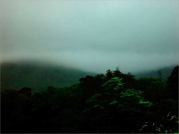 is from County Connemara, Ireland. Without editing, the photo is kind of boring (trust me). But I was playing with the Curves adjustment in Photoshop, and something happened with the foliage: parts of the forest emerged as bright and saturated, while the rest fell dramatically into darkness. It was a very striking effect. It took took some tweaking to make that effect work without distorting the rest of the picture, but I think the result is interesting.
By the way, while I accomplished this manipulation digitally, it's not anything that couldn't be done with film in the development process. So don't get all purist on me.
Recommended reading
Giotto to Durer: Early Renaissance Painting in the National Gallery, by Jill Dunkerton, et al. If you get only one book about Renaissance painting, this is the one. The reproductions are excellent and numerous. The text reviews not just trends in the evolution of subject matter and symbolism, but also how paintings were commissioned, what workshops were like, and how artists were trained. Best of all, it has extensive information on what is now understood about the construction of paintings, from support, to ground, to pigments, to binding media. All of this is explained in a manner that doesn't assume that you already know a lot about conservation science, but with enough detail to really understand the subject. It's a great reference and a great way to understand how the Renaissance changed the course of Western art.
20 July 2006

Tempera grassa 2
(First post on tempera grassa here). For some examples of great modern (20th century) paintings done in tempera grassa, check out the web page on Pietro Annigoni (1910-1988) at the Art Renewal Center.
Tempera grassa paint is a little like egg tempera (if you've tried that) and a little like oil paint, but mostly it is its own beast. It is much easier to control tempera grassa if you paint in thin layers and have relatively little paint on the brush when you make a stroke. It is, however, more flexible in application than egg tempera, and allows much more blending and re-working of the paint. To adjust the consistency of the paint, you can add as much water as you like, so long as the ratio of medium to pigment is correct. You can apply thin washes or heavy smears of oil-like paint. Never apply thick blobs of paint (impasto) as it can crack as it dries.
Small and medium-sized sable or soft synthetic brushes are best. Firmer bristle brushes can also be used—a bristle brush holds more paint and is good for initial lay-ins. Be very sure to clean your brushes afterwards, as the oil will take its toll on them if you are not careful. For cleaning, I’ve had good luck with wiping brushes first with cheap linseed (not vegetable) oil, then washing very thoroughly with soap and warm water.
The paint will quickly dry on the palette if it is not kept moist (a spray mister is good for this). After an hour or two, the paint is more difficult to work with; scrape it off and make a new batch. Working with tempera grassa will be frustrating until you come to understand the process by which it dries. Because it is composed of substances that dry at very different rates, the paint goes through multiple stages as you paint. By keeping these stages in mind and learning to work with them instead of against them, you will find that tempera grassa is extremely flexible, in some ways like a water-miscible oil paint.
In my experience, these seem to be the changes the paint goes through:
1. The paint is WET. As you first apply the paint, it is entirely workable. If you squeeze most of the paint from the brush, tempera grassa can be applied with drybrush hatching strokes, which tend to fuse together slightly (unlike egg tempera). It can also be gently blended with fingers or a soft dry brush. If the brush is loaded with more paint, it goes on loosely like any water-based paint. Once on the surface, it has a consistency similar to gouache and, depending on the recipe and the thickness of the paint, is workable for anywhere between one and five minutes.
2. The paint is TACKY. As the water evaporates out of the paint, there is a point at which it becomes sticky and difficult to work with. As you feel it enter this stage, leave it alone. It is not workable and attempts to manipulate it will pull up multiple layers of paint. If you accidentally dig a hole in the paint, stop and let it set before trying to fix it. It is possible to deliberately work with the paint at the tacky stage to create interesting textural effects, but this requires practice before the technique becomes controllable.
3. The paint has SET. The water has evaporated and the egg component is holding the paint in a semi-solid state. It feels firm but damp to the touch; rubbing will pull it off the surface. If the paint is applied thinly and the recipe is egg-rich, it will set a few minutes after becoming tacky (less if it was drybrushed on). If the recipe is oil-rich, it can take a long time to set (or there may not be enough egg for it to truly set at all). When the paint reaches this stage, you can paint over it, but only with soft brushes and a fairly delicate touch. Too much paint, or too firm a hand, will disrupt the surface just as if it were tacky. If the paint refuses to set properly after 20 or 30 minutes, a layer of thinned egg yolk (no oil) can allow you to paint over it without needing to wait for it to firm up.
4. The paint is DRY TO THE TOUCH. With egg-rich tempera grassa recipes, it takes anywhere from ten minutes to several hours before the paint feels dry and can be worked over without the risk of disrupting lower layers. If the recipe is oil-rich, it can take days to get to this state. Placing the painting in a sunlit room as it dries is a good idea—it won’t make the oil dry faster, but the actinic light will strengthen the egg component of the paint.
5. The paint is DRY. The oil component of the paint has oxidized to the point that the paint has hardened and is difficult to scratch with a fingernail. This can take anywhere from a day to a bit more than a week.
The working quality of these stages and the time it takes to reach them depend on the recipe you are using, how much you have diluted the paint, how thickly you are painting, how wet the layers underneath are, and local weather conditions. In order to paint easily with tempera grassa, you will need to constantly attend to the feel of the paint in order to get a sense of what stage it has reached. You can’t keep adding layers indefinitely, so you must recognize when it is time to stop working on a given passage and let it dry. Compared to oil painting, however, tempera grassa requires far fewer instances in which you must skip working for days at a time in order to allow the paint to dry.
18 July 2006
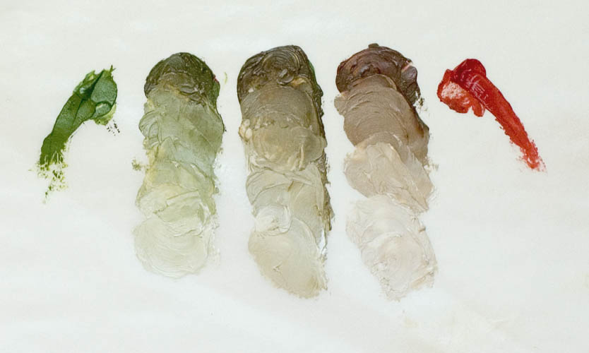
An earth palette for mixing flesh tones
There are any number of ways to mix useful colors to represent flesh tones. A set of flesh mixtures needs to be able to harmonize across light and shadow zones and represent different local flesh colors within a single person. It also needs to work well for people of different races and complexions.
Lately, I've been working with a flesh palette composed entirely of earth pigments (plus white). Here are the oil colors I currently use:
1. Flake/zinc white (the only non-earth color in this palette). I like Doak's flake #1c. Williamsburg silver white (another flake/zinc combo) is also nice, but kind of thick.
2. Raw sienna. This is Williamsburg Italian raw sienna.
3. Burnt sienna. Williamsburg. This is an earth red, semi-transparent and slightly violet in tone.
4. Red ochre, Williamsburg. Another earth red; this one is more opaque and a more neutral red.
5. Tuscan red. Studio Products. A violet-red, semi-opaque. Good for toning lips and cheeks.
6. Ultramarine blue, Studio Products. I call this an earth color because ultramarine blue pigment was originally extracted from lapis lazuli. Modern ultramarine is synthetic (and much cheaper) but chemically identical.
7. Vermllion, Doak. This is genuine vermillion (mercury sulfide), a bright orange red. It's very strong and only a tiny amount is needed in mixtures. I call this an earth color because it is a synthetic version of the mineral pigment cinnabar. Vermillion is particularly wonderful because, when mixed with white or broken with other colors, it retains much of its chroma. Cadmium reds of similar hue, by comparison, become dull in mixtures.
8. Terre verte, Williamsburg. This is the brightest, cleanest, and coolest green earth I've encountered. It is much stronger than other green earths, even though the company says that it hasn't been enhanced with any other green pigments.
9. German earth, Williamsburg. This is an earth black.
10. Yellow ochre, Williamsburg. A basic dull yellow.
11. Yellow ochre extra pale, Doak. This is lighter in tone and higher in chroma than regular yellow ochre.
12. Raw umber. Williamsburg.
13. Burnt umber. Williamsburg.
This is more colors than strictly necessary, but the variety is convenient, since you don't need to do quite as much mixing. (Also, I'm a sucker for beautiful earth pigments.) This palette is not flexible enough for most sorts of general painting (although you can do a heck of a lot with it), but for realistic flesh tones you can easily get pretty much any color you need.
I painted the self portrait posted earlier with this palette. Caucasian flesh is best painted with a mixed orange base, for which I use a blend of red ochre and yellow ochre. I mix a string of this color with white to mix a series of values. I then mix a string of darker values by adding raw umber to the ochre mix. I set up a neutral string of raw sienna and ultramarine mixed with different amounts of white. Sometimes, I have an additional neutral string of burnt sienna and terre verte or raw umber and German earth. For most purposes, the ochre mix is too high in chroma, so I mix it with one of the neutral mixes of the same value to get the paint that I will apply to the painting.
To adjust the hue of darker values, I add any combination of ultramarine, German earth, raw umber, burnt umber, or terre verte. I can lighten with white without loosing too much chroma and getting a "chalky" appearance. Areas of skin that receive more blood, like the ears, cheeks, and nose, can be reddened (or glazed) with vermillion, burnt sienna, red ochre, or Tuscan red. More sallow areas can be toned with either of the ochres. African skin tones can be mixed by adding umber, ultramarine, or terre verte to the yellow ochre + red ochre mix. Asian skin tones can be made by adjusting the proportions of the base ochre mix.
If you like to paint in multiple layers, you can do a cool underpainting with ultramarine, terre verte, or a traditional Italian neutral "verdaccio" (which traditional Renaissance Italians mixed from white, black, yellow ochre, and red ochre and applied over a flat terre verte base). Allow to dry, and then glaze with appropriate colors, with transitional tones and darks blending with the underpainting to create interesting tones that can't be created by direct mixing.
Earth colors tend to naturally harmonize with each other. They also have the advantage that they are generally low in chroma (intensity). Skin tones are much lower in chroma than most tube colors, so if you are working with more chromatic colors, you need to do a lot of work to get accurate tones. Many artists have trouble mixing accurate skin tones, because they have difficulty neutralizing the high chroma colors on their palettes. Most flesh is really low in chroma—near neutral—and you see a lot of amateur (and some professional) work in which flesh tones look wierdly chromatic.
You'll note that I use a lot of earths by Williamsburg. They make a nice range of high-quality oil paints, with an extraordinarily good set of earth colors. The consistency is a little thicker than I prefer, but otherwise they are excellent. I mentioned Robert Doak's paint earlier, and Studio Products paint is also top of the line.
By the time he was my age
Raffaello Sanzio (Raphael) had been dead for six years.
I'd better get busy.
I'd better get busy.
Winter's end
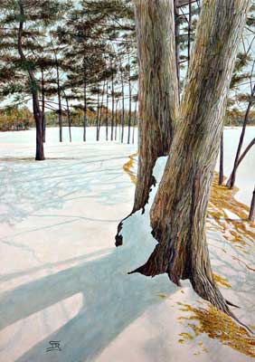 This is a few years old, from back when I was painting in acrylics. It's my best painting from that period.
Acrylic on panel, 28 x 20".
17 July 2006
Tempera grassa 1
Tempera grassa was a common painting medium in the 15th century. Since then, not so much (though with a few notable exceptions). It's an interesting medium to work with.
Tempera grassa is an emulsion of egg and oil (an emulsion is a liquid in which tiny drops of another liquid are suspended). Egg yolk is a natural emulsion that incorporates oil into its makeup fairly easily. You are already familiar with an egg-oil emulsion—it’s called mayonnaise. Tempera grassa is essentially mayonnaise made with a drying oil such as linseed or walnut.
To make a simple kind of tempera grassa, separate an egg yolk and put it into a small cup. Measure the volume of yolk, then measure out the desired volume of oil. Add just a few of drops of oil to the egg, mixing thoroughly as you do so. Add a little more oil and continue mixing. Repeat, adding oil a few drops at a time, until all of it has been blended in.
The amount of oil to use will depend on your preference; anywhere from a few drops to an amount equal to half again the amount of egg will work. The more oil, the more slowly the paint will dry and the more it will handle like oil paint. If you are just starting, try five parts egg to three parts oil (which produces a moderately egg-rich mixture). If you’ve worked with egg tempera, an egg-rich formula will handle in a familiar way. Once you have mixed the egg and oil into an emulsion, you will want to add some water, blending it in a few drops at a time in the same manner that you added the oil. I have had good results with a mixture of 5 parts egg to 3 parts oil and 1.5 parts water, but you should feel free to experiment.
This substance is your painting medium. It will keep in the refrigerator for a week or so, depending on how much oil it contains (throw it away and clean the container thoroughly if it starts to smell). Mix in a couple of drops of water before each day’s session to compensate for evaporation. You can make paint with it by mixing together approximately equal amounts of medium and a paste of pigment and water. You can thin the paint with any desired amount of water; the important ratio is that of medium to pigment.
Raw pigment powder is available in some larger art stores and from places like www.sinopia.com. Prepare it by putting the powder into a small jar, adding distilled water, and shaking. Wear a dust mask when working with pigment powders.
Some artists use tube watercolor or gouache paint instead of pigment for egg tempera and tempera grassa. I haven't tried that (you may have noticed that I'm kind of a purist with these things), but I don't see any reason why it wouldn't work.
It is important get the ratio of pigment to binding medium right with tempera grassa. Practice on test pieces until you can consistently make acceptable paint. Tempera grassa paint made with too little medium will feel powdery once it dries. You can correct this by painting over it with thinned medium or with thinned egg yolk. Tempera grassa paint made with too much medium is difficult to work with and dries poorly. After the water and egg dry, it will have a crumbly, sticky feel if you run your hand over the surface. Don’t paint additional layers over it in this state, as you will probably get poor adhesion. You can either wait for the oil component of the paint to harden, which can take a day or two (or more with an oil-rich formula), or you can carefully scrape the paint off with a knife and start over. It is also true that tempera grassa mixtures very occasionally fail to form stable emulsions, becoming gummy and unworkable. The paint will then refuse to dry for very extended periods (up to a couple of weeks). I don’t know why this occurs; I’ve had this happen only a couple of times. If the medium seems intractable or the oil and egg combine incompletely, throw it away, scrape off any paint you may have applied, and start over.
More later.
16 July 2006
Inishmore
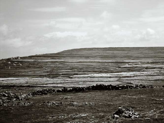 This photo is a view across the island if Inishmore, in the Aran Islands off the Western coast of Ireland. The island once had a population far greater than it does now, and it's been inhabited for more than 5,000 years. There are remains of stone walls everywhere (that's what those horizontal lines across the hills are), so the place seems incredibly empty and full of ghosts.
Carrowmore
 This is a photo from a 5,000 year old grave site in County Sligo, Ireland. The place is big and I remember that I only had a few minutes there, since I had to go meet my wife. It was raining intermittently, and I raced through the grass looking for good shots.
Dun Aongas 2
 The main challenge in working with the picture in Photoshop was handling the sky. Some of the highlights are blown out, so I needed to use the Curves function to determine how to make that look deliberate, so that the sky looks powerful but not overwhelming.
Earlier Dun Aongas photo here.
Mike
 This is graphite on paper, from life. This kind of drawing is time-consuming; this drawing took five three-hour sessions. It's the first time I've brought a drawing to this level of finish.
15 July 2006
Additive and subractive color mixing
Paint is mixed according to the rules of subtractive color. When light hits paint, some wavelengths are absorbed, while others bounce off. A pigment that absorbs all visible wavelengths except red will be perceivewd as red, for example. If you mix two pigments together, they will both absorb their characteristic wavelengths. What you see is whatever light is not absorbed by either of the two pigments. For example, say you mix a greenish blue with a greenish yellow. The greenish blue absorbs everything but green. The greenish yellow absorbs everything but green also. So what you see when you mix them is green. Of course, any pigment reflects different amounts of different wavelengths, rather than one pure color. So even an orange yellow has a bit of green in it. If you mix the orange yellow with a violet blue, you will get a green. There will be much less green, however, so you will get a duller, darker green than with the first mixture.
Light mixes according to the rules of additive color. The results are different than those with subtractive color. If you mix a bunch of pigments together that among them absorb all wavelengths, you will get a black (or very dark grey). If you use a projector to mix all the wavelengths together additively, however, you will get white.
It's very userful to understand these factors. I once saw a painting depicting a sky shading from yellow to blue. The artist (an amateur) blended the two colors together and got a band of green between the two. Unfortunately, he was trying to depict an additive color mixture (light in the sky) using a misunderstanding of subtractive color. To depict such a sky with paint, you would never mix yellow and blue. Instead, you'd paint a band of neutral gray between the two colors. To avoid such mistakes, it's very helpful to understand these distinctions.
Describing color
In order to talk precisely about color, we need some precise terms. In the most useful system of describing color, three parameters are needed to clearly describe any color. Those parameters are hue, value, and chroma.
HUE is where a color falls on the spectrum (or color wheel). For example, a color could be greenish-blue. There are an infinite variety of hues, but we can divide them into groupings that are easy to work with. One way is with three primaries and three secondaries. It's useful to use red, blue, and yellow as the three primaries. The secondaries are orange, violet, and green. Secondaries can be mixed from primaries, but primaries are not mixable. For example, you can mix orange from yellow and red, but you can't take two non-reds and mix a red. Functionally, most pigment colors are not "pure;" they have a bias toward one of the colors next to them. It's hard to find a simple red, but there are lots of violet-reds and orange-reds. Same goes with yellow greens, violet blues, and so on. A few pigments are pretty close to pure primaries.
VALUE is how light or dark a color is. You can have a violet blue that is dark, light, or somewhere in between. The eye pays more attention to value than it does to anything else. Therefore, in drawing or painting, value is the most important parameter to get right. Black pigment (or a mixed black) is the darkest value available. White is the lightest value available.
Because the real world has a much broader value range than paint or other media do, the artist often needs to make frequent judgments about how to represent a particular effect. For example, last night I was drawing a kneecap in graphite on white paper. There was a strong highlight on the kneecap that I wanted to render precisely. In order to get the highlight to look as noticeable as it is in real life, I needed to darken down the area around the kneecap to get the right contrast. In doing so, I made the area around it darker than I otherwise would have rendered it. I had to make a choice, within my limited value range, of whether to be realistic with the lights, or the highlights. I couldn't do both at the same time.
CHROMA is how intense the color is. Neon yellow is very high in chroma. Brown is a low chroma orange-yellow or yellow orange (there is no brown on the color wheel; it's a zone within the overall color space of yellow and orange). The majority of colors that you can buy in a tube are high in chroma. But most of the world is low in chroma. Look around you; how much of what you see is really high intensity color? If you want to paint realistically, you need to learn to mix more neutral colors. There are a couple of ways to do that: one is to mix with complimentary colors (those that are on the other side of the color wheel). Another is to mix with a neutral grey of the same value (note: black and white make a blue-gray, not a neutral gray). It takes a lot of practice to get good control over mixing of neutrals and near-neutrals.
Update: Lawrence Humphrey (in email) kindly pointed out that I misstated the number of secondaries. That's been corrected.
A typical book on drawing or painting
has one page, more or less, showing the effects of light and shade on, say, a cylinder, a cube, and a sphere.
Light for the Artist, by Ted Set Jacobs, is a whole book on that subject alone. It talks about light on different kinds of surfaces and how to render changes in hue, value, and chroma depending on the nature of the light and the surface it falls on. Ted reviews different approaches to depicting light, rejecting symbolic methods in favor of careful observation and realistc rendering. He presents a logical terminology for describing light, avoiding confusing terms like half tone (since light travels in a straight line, each point on a surface is either illuminated by a light source or not; there can't be any half illumination or "half tone"). He focuses not on generic geometric solids, but on the kinds of complex, packed curves found on organic forms. He shows how to render a variety of lighting situations realistically, including a single point source, multiple light sources, and diffuse light. If you are interested in realist painting, I can't recommend it highly enough. I've never seen any other source for this kind of information presented this cogently and in this much depth.
Unfortunately, the book is out of print and used copies are often expensive. If you can't find a copy at your local library, it's worth the investment.
14 July 2006
Principles of organic form 3
First post on this topic here. Second post on this topic here.
We're getting into principles that are useful not only in drawing the contour of the form, but also in rendering interior forms.
FORMS MERGE INTO ADJACENT FORMS. Forms of the body are not discrete. Think about how the inside of the upper arm merges into the lower arm. The curve of the biceps anticipates the inside of the elbow as it approaches it. If you just draw the upper arm, then the lower arm, without observing how they merge together, the form will not look organic; it will look like a marionette. The way that form merges together must be carefully observed; it varies depending on muscle flexion, angle, and so on.
SMALLER FORMS ARE PACKED WITHIN LARGER FORMS. Think of a large form, such as the thigh. Although you can approximate it with a sort of smooth tube shape, when you look closely you see that there are smaller forms along the whole length of the larger form. Nestled within those sub-forms are even smaller forms. In order to render the thigh in such a way that it looks organic, we need to carefully observe how those sub forms interact with the main form. This becomes especially important as we try to represent how light washes across a complex array of packed forms.
FORMS KNIT TOGETHER. Think of the center of the breastbone. In that spot you can easily see where the left and right sides of the body were joined together as the body formed in the womb. The line of that joining isn’t straight; it meanders back and forth, suturing together. While the center line of the body is the easiest place to see this effect, it is also true across the whole body. The form of the wrist knits into the form of the hand. The form of the thigh is woven into the form of the hip. If we just render even gradations of light over a form, we’ll miss this interweaving and the form won’t look organic.
ALL FORMS ARE CURVED. The body is composed of rounded forms. This principle is relatively easy to understand and make use of when you are drawing the outline of the body: all of the lines you draw are curves. That's the case even though bones are relatively straight, because the sinews and muscles around the bones wrap around them and create roundness. But it also has a less obvious implication when you are using gradations of value to depict three dimensional organic form: every point on a curve is receiving a different amount of light than any point next to it. That is to say, every part of the body is part of a value gradient. If you draw or paint an area of flat color that does not change in value, it will look flat, not round, and therefore not organic. All forms on the body, large or small, must be rendered as a gradient (however subtle) from one value to another in order to look organically rounded.
Vertigo
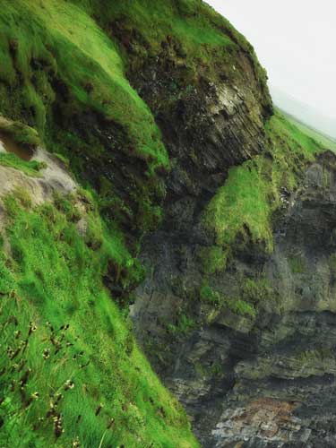 This is a photo of the Cliffs of Moher in Ireland. The thing I remember most, aside from looking down at the long, long drop to the rocky shoreline, is the wind. The wind is continous, and intense enough to knock you down. Every year or so, a tourist goes over the edge, despite the fences and warning signs.
Principles of organic form 2
First post on this topic here.
CURVES NEVER HAVE THEIR HIGH POINT IN THE CENTER. If you are drawing a curve (say, along the edge of a shoulder), the high point of the curve will never be at the center of the curve. It will always be closer to one end point than another.
FORMS DO NOT MIRROR EACH OTHER. Think, for example, of a forearm. The curve of the outside of the forearm will never be a mirror image of the inside curve. Throughout the whole body, inside and outside curves are never the same. When you find such a mirrored curve in a drawing or painting, it will almost always be inaccurate. The upper eyelid is not a mirror of the lower eyelid. The left side of the calf is not a mirror of the right side. The shapes of the curves will be different; their lengths, amplitudes, and high points will be in different places. The only exception is this: because the body is approximately symmetrical from left to right, you can sometimes find a form on the right side of the body that comes close to mirroring a form on the left side. But because we don’t normally stand or sit exactly vertically, it almost never works out that way, either.
I was looking at a magazine for artists the other day, and there was an article on the work of an instructor in figurative are. He runs a school to teach others all about academic figure drawing. But he mirrors his forms all the time. His work looks rather clumsy as a result.
13 July 2006
Recommended reading
The Materials and Techniques of Medieval Painting, by Daniel V. Thompson. This small book is great, even if you're not an art geek like me. Thompson was one of those rare authors who was both completely immersed in his small area of specialization and also able to explain it in chatty, comfortable, engrossing detail to people who don't know anything about it. It's a little dated (for example, he was writing before the rediscovery of lead tin yellow as the standard artificial opaque yellow pigment from the later Middle Ages through the Baroque period), but for the most part it's a great survey of how artists painted back in the day.
12 July 2006
Karin Jurick
Has some great stuff over at her Painting a Day Blog. I've seen a number of painting/drawing/sketch/conceptual installation a day kinds of web sites. Some of them are great, but often they are the same smeary mess one day after another. For paintings done so quickly, her work is consistently good. Great color (strong, chromatic, but not overwhelming), good composition, good technique. I can't work anywhere near that fast. Check it out.
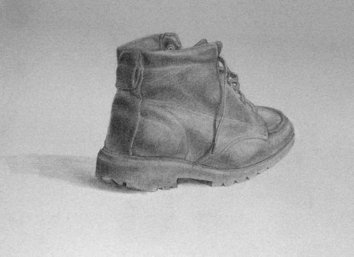
Heaven and Earth
 This is a photo from County Connemara in Ireland. I chose to darken the (already fairly dark) foreground. I like this one because of the abstract quality of the almost parallel grey, light, and dark diagonals.
The Three Graces
 A couple of years ago, I did a copy of a portion of Sandro Botticelli's La Primavera. It is in tempera grassa on panel, 16 x 20".
You can see the original Botticelli painting here.
Tempera grassa is an emulsion composed of egg yolk and a drying oil (linseed in this case) mixed with pigment. It was commonly used in Italy during the transition from egg tempera* to oil painting in the 15th century; Botticelli used it to paint the original.
You can see a writeup of how I made this painting here.
Tempera grassa continued to be used through the Baroque period, but mostly fell out of use after that. During the 20th century, as a variety of traditional media such as fresco and egg tempera were revived, it came back into limited use, most notably by Pietro Annigoni.
*If you don't know what egg tempera is, then you're not an art geek like me. Just keep reading this blog. We'll have you up to speed in no time.
11 July 2006
Principles of organic form 1
Let's talk about figure drawing. In most drawing methods, the first task is to create a line drawing of the edges of all significant forms. In the drawing system I've been studying, this line drawing is called the contour. Each part of the contour represents a horizon. In other words, it is the last part of the form you see before it curves out of sight.
In developing an acurate contour, it's helpful not only to learn to draw what you see, but also to understand certain principles by which organic form is organized. Without that understanding, it's easy to unconsciously impose the wrong kind of order on the form you're looking at, and then fail to see the small errors that creep in. That's why it's useful to have a checklist in your head of how organic forms are organized, so that you can make sure what you think you see is what you really see.
That's not to say that you should impose some kind of predefined idea of what the form should look like. But the fact is that every organic form I've ever drawn follows these principles, so understanding them helps you to be an informed observer. For example, a couple of weeks ago my teacher looked at a drawing I was working on and noted that the terminator (the shadow edge) of a forearm was parallel to the contour of the top of the arm. I'll talk about the avoidance of parallel forms later, but for now just understand that I looked at the arm in question and realized that I had imposed the wrong kind of order on my drawing. The terminator on the form I was looking at was not parallel to the edge of the form, but I had drawn it that way. Keeping these kinds of principles in mind makes it easier to draw what you see, because it helps you draw correctly and to identify and fix the mistakes that you make.
This will be an ongoing series of posts to describe a series of principles that are useful to understand in drawing the contour. These principles are at least as important has having a technical knowledge of anatomy, because they apply to all of the forms of the body, and do not tend to vary from person to person so much as formal anatomy does.
CURVES ARE CONVEX, NOT CONCAVE. All forms of the body are composed of curves, not straight lines. While it is quite possible to represent the contour via a series of straight line segments (and, in fact, many drawing methods start with an initial block-in that consists of straight lines) the actual contour consists of curves. Some of those curves are relatively straight, but they will look wrong unless you find the real curve rather than simplifying them into a straight line.
And the curves are not just any curve; they are always convex (pushing outward). That is the case even if the model is very skinny. The forms of the body are full, not hollow. Of course, there are many parts of the body where the largest forms go inward. Think of the web between the thumb and the first finger, for example. But if you look closely, the smaller curves that make up these larger forms are full; sometimes very subtly so. They are composed of convex curves smoothly joined together. If you draw these forms as concave (hollow), as they may at first appear, they won't look quite right.
If you think about it, this principle makes sense. The body is a mass of tissue enclosed by skin. The tissue (muscle, bone, sinew, fat) pushes outward against other tissue and against the skin. That tension creates full, outward-pressing forms. Where the skin is slack, such as around wrinkes or where the skin is larger than the tissue it encloses (as in parts of the body of an older person), the skin still tends to fall in curves that are convex, because the interconnecting tissue that the skin itself is composed of tends to push outward against itself.
Try looking at your own body, or that of people around you (they don't have to take off their clothes, although that can be nice). Look for the way that every horizon of every part of the body is composed of interconnected convex curves.
More on this later.
In developing an acurate contour, it's helpful not only to learn to draw what you see, but also to understand certain principles by which organic form is organized. Without that understanding, it's easy to unconsciously impose the wrong kind of order on the form you're looking at, and then fail to see the small errors that creep in. That's why it's useful to have a checklist in your head of how organic forms are organized, so that you can make sure what you think you see is what you really see.
That's not to say that you should impose some kind of predefined idea of what the form should look like. But the fact is that every organic form I've ever drawn follows these principles, so understanding them helps you to be an informed observer. For example, a couple of weeks ago my teacher looked at a drawing I was working on and noted that the terminator (the shadow edge) of a forearm was parallel to the contour of the top of the arm. I'll talk about the avoidance of parallel forms later, but for now just understand that I looked at the arm in question and realized that I had imposed the wrong kind of order on my drawing. The terminator on the form I was looking at was not parallel to the edge of the form, but I had drawn it that way. Keeping these kinds of principles in mind makes it easier to draw what you see, because it helps you draw correctly and to identify and fix the mistakes that you make.
This will be an ongoing series of posts to describe a series of principles that are useful to understand in drawing the contour. These principles are at least as important has having a technical knowledge of anatomy, because they apply to all of the forms of the body, and do not tend to vary from person to person so much as formal anatomy does.
CURVES ARE CONVEX, NOT CONCAVE. All forms of the body are composed of curves, not straight lines. While it is quite possible to represent the contour via a series of straight line segments (and, in fact, many drawing methods start with an initial block-in that consists of straight lines) the actual contour consists of curves. Some of those curves are relatively straight, but they will look wrong unless you find the real curve rather than simplifying them into a straight line.
And the curves are not just any curve; they are always convex (pushing outward). That is the case even if the model is very skinny. The forms of the body are full, not hollow. Of course, there are many parts of the body where the largest forms go inward. Think of the web between the thumb and the first finger, for example. But if you look closely, the smaller curves that make up these larger forms are full; sometimes very subtly so. They are composed of convex curves smoothly joined together. If you draw these forms as concave (hollow), as they may at first appear, they won't look quite right.
If you think about it, this principle makes sense. The body is a mass of tissue enclosed by skin. The tissue (muscle, bone, sinew, fat) pushes outward against other tissue and against the skin. That tension creates full, outward-pressing forms. Where the skin is slack, such as around wrinkes or where the skin is larger than the tissue it encloses (as in parts of the body of an older person), the skin still tends to fall in curves that are convex, because the interconnecting tissue that the skin itself is composed of tends to push outward against itself.
Try looking at your own body, or that of people around you (they don't have to take off their clothes, although that can be nice). Look for the way that every horizon of every part of the body is composed of interconnected convex curves.
Artist quotes 2
"God, I've frozen my ass off painting snow scenes!"
(Andrew Wyeth)
"When art critics get together they talk about Form and Structure and Meaning. When artists get together they talk about where you can buy cheap turpentine." (Pablo Picasso)
"Painting and sculpture, labour and good faith, have been my ruin and I continually go from bad to worse. Better it would have been for me if I had set myself to making matches in my youth. I should not be in such distress of mind." (Michelangelo)
Best portrait ever
 This is Juan de Pareja, by the great Diego Velazquez. Every time I go to the Met in New York I stand and stare at it, wondering how others can just walk by. I think this is the best portrait in the world. It captures a sense of presence and humanity like no other painting I've ever seen.
(And before you say anything, Leonardo's overworked Mona Lisa doesn't even come close.)
10 July 2006
Photoshop greyscale conversion
I love black and white photography. Here are some ways to convert color digital images to black and white (or variations on the theme of low saturation tone) in Photoshop. There are special programs and plug-ins for doing this, but I find that Photoshop has all the flexibility I need.
The simplest, and least satisfying, method of converting a color photo to greyscale in Photoshop is to choose Image -> Mode -> Grayscale. It just strips the color information out of the file, converting each pixel to a shade of grey. You have not control over the process. This is not the right tool. Never use this.
A better way is to create a Channel Mixer adjustment layer in the layers palette. In the dialog box, you can choose the percentage of each channel that contributes to the final image (it's good to have the numbers add to approximately 100). Play around with different values until you get an image you like. This is a good way to do it, especially since the adjustment layer doesn't change the original image. You can change the channel mixer values, or go back to color, any time you want. You can also adjust the opacity of the channel mixer layer to desaturate the image to whatever degree you like.
Even more flexible (but more complex) is this method: first, create a Hue/Saturation adjustment layer (rename it to "desat"). Change its blending mode to Saturation. In the dialog box, move the Saturation slider to 0. Now the image is greyscale; big deal. But now create another Hue/Saturation adjustment layer underneath the first (rename it "tone"). Play with the Hue slider. As you do, you see a dynamically changing view of the image as colors used to create the grayscale image change. You can select for yourself the value that best brings out shadow detail or whatever you like. If you like a toned effect (like sepia, only with whatever tones you want), create a Color Balance adjustment layer on top of the two other layers. Try changing the color values differently for shadows, midtones, and highlights. For example, you can have a "greyscale" image with cool darks blending into warm highlights.
Very nifty.
I used to be able to call myself a "self-taught artist"
but trying to learn by trial and error only goes so far if you want to really learn realist painting methods. So a couple of years ago my wife Kirsten and I started taking figure drawing and painting classes with Dennis Cheaney at the New England Realist Art Center in Boston Massachusetts. Dennis is a student of Ted Seth Jacobs, who is pretty much universally acknowledged as one of the modern masters of realist art. Tony Ryder, a well known artist and teacher, is also one of Ted's students.
Dennis runs classes that are useful regardless of the student's level of achievment. If you live in the Boston area and are interested in in-depth art instruction, I cannot recommend Dennis highly enough. The emphasis is on developing a clear understanding of three things: (1) the principles of organic form; (2) how light interacts with form; and (3) how to render that interaction in drawing or painting. I'll post more about this later.
Because Kiri and I are expecting our first child (a boy!) in August, we'll have to take a leave of absence from art class for awhile. I'm sure that won't be the last sacrifice we make for the little tyke.
09 July 2006
I have to confess
 that I've had the hots for this lovely lady ever since I saw her wonderful portrait in the Metropolitan Museum of Art. She's Maria Baroncelli, painted by Hans Memling shortly after her wedding to Tomaso Portinari in 1470. Isn't she a cutie?
Alas, I don't think it's going to work out. For one thing, there's my wife (and Maria's husband). Also, I don't know if she'd be interested in someone so much younger than her.
Sigh.
Silly art terminology rant
I think that painting outdoors, from life, is a fine thing to do. I have the utmost respect for those who practice this kind of painting, as it is very difficult to do well. But I find the term most commonly used to describe outdoor painting to be insufferably precious.
"Do you paint en plein air?"I can certainly understand adopting a technical art term from French (e.g., ebauche) or Italian (e.g., velatura) if there is no good English equivalent. But, with apologies to those who might find the term evocative (or marketable), using "en plein air" to mean "outdoors" is just too highfalutin for me.
"Why yes! I painted en plein air yesterday in the park. Alas, it rained."

Oil painting medium
In painting jargon, a medium is something you add to paint to change it's handling properties, drying time, gloss, transparency, or other characteristics. Here's the recipe for my current favorite general purpose oil painting medium.
Combine equal parts Canada balsam, black oil, and oil of spike. Warm just enough to allow the incredibly thick and sticky Canada balsam to go into suspension with the other ingredients. Shake before using. Mix a very small amount into your paint to make it brush out more easily, adhere better to the previous layer, and dry more quickly. Keep covered to limit evaporation (you can add a touch more spike if it gets too thick).
Canada balsam is a sap from fir trees. Balsams improve adhesion from one paint layer to another and impart a certain silky smooth quality to paint. Canada balsam is clearer and faster-drying than other balsams, such as Venice turpentine. It also costs a lot more.
Black oil is linseed oil cooked with litharge (lead monoxide). Black oil is faster drying and more slippery than linseed oil. Like many art materials, it's poisonous, so you need to be careful not to ingest it.
Oil of spike is an organic solvent like spirits of turpentine, except that it is more slippery and evaporates more slowly. It has a very strong and wonderful smell (and is much more commonly used in aromatherapy than painting), although my wife doesn't like it. It has a long history in oil painting; Leonardo probably used it for the initial dark washy underpainting in his "sfumato" technique.
N.B., you can get all of these specialty artist's ingredients from Studio Products.
Artist quotes
"Beauty is the purgation of superfluities."
(Michelangelo)
(Michelangelo)
"My beard towards heaven, I feel my nape support
The back of my head, I grow the breast of a harpy
And my brush as it drips continually
Upon my face, makes it a gorgeous floor."
(Michelangelo)
"If people knew how hard I worked to achieve my mastery, it wouldn’t seem so wonderful after all."
(Michelangelo)
"I have offended God and mankind because my work didn’t reach the quality it should have."
(Leonardo da Vinci)
"A painter was asked why, since he made such beautiful figures, which were but dead things, his children were so ugly; to which the painter replied that he made his pictures by day, and his children by night."
(Leonardo da Vinci)
I know
this composition is a bit wierd, but I like it. I took the photo in a field in North Grafton, Massachusetts, near the Cummings School of Veterinary Medicine. I don't usually mess around with wierd tilted horizons, but I think that the various diagonals make a pretty cool composition. I don't think it would quite work without the tree in the distance providing balance and a sense of depth.


Self portrait
Yep, this is me. Oil on panel, 20 x 20". The nose is a bit too long, but otherwise a decent likeness. It's done from life, peering into a mirror.
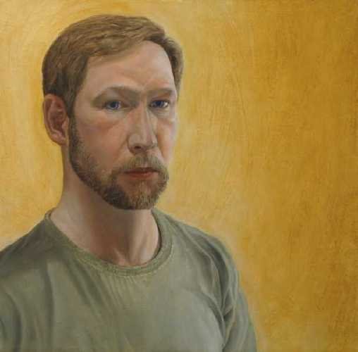
Robert Doak
runs an art materials store in Brooklyn, NY. He is a strange old guy with very strong opinions about how paintings should be made. If you are an artist, his shop is full of needful things. If you call him or walk into his store, you won't be able to escape having a very long conversation about art, in which he tries to figure out what kind of painter you are so that he can recommend what you should buy from him. He is something to experience, although you should by no means treat all of his opinions as gospel.
He makes oil paint. It is, unlike any other brand that I am aware of, ground in a blend of linseed and walnut oil. The paint is really good stuff, highly pigmented and very fluid. No one makes better blues than Robert Doak. It is amazingly inexpensive for top of the line paint. The paints are made to maximize quality rather than shelf life, so they often separate in the tube. That's OK; just squeeze the paint out onto absorbent paper, wait a minute or so for the extra oil to settle out, and transfer to your palette with a knife. It's worth the trouble.
Robert has no web site; he only recently began accepting credit cards (before that, mail order was done by check, and if he'd done business with you before, he'd mail out your order on the strength of your promise). Robert Doak & Associates, Inc., can be reached at 89 Bridge St., Brooklyn, NY 11201, or by phone at (718) 237-1210. Call before stopping in, as he's not there every day. If you are a painter in oil, watercolor, tempera, pastel, or any other traditional medium, you owe it to yourself to get in touch with him. When he goes, there won't be any more.
Updated information on Robert Doak's paint here.
Dun Aongas
 Dun Aongas is a stone fort on the island of Inishmore off the West coast of Ireland. It is more than 4,000 years old, and we know very little about the people who built it (although it's a pretty safe bet that they had enemies). It is one of the most amazing places I've ever been. I'll post some other photos of the place later.
Blue Jeans
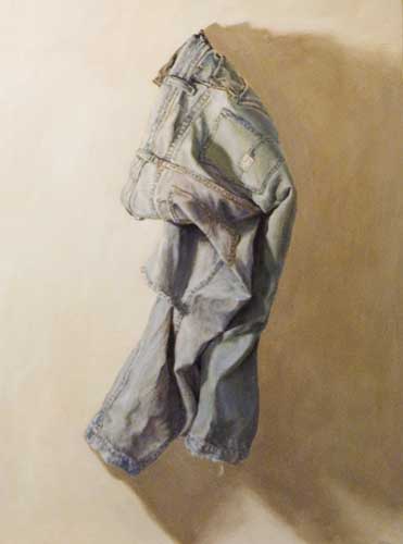 Here's a recent painting. Blue Jeans, 16 x 12", oil on panel. I think this one represents a step forward for me. It's technically my first still life, although not exactly traditional. I posted this to a couple of art fora and got better feedback on this than any other painting I've shown. I think it's because of the strong, simple composition. Right now I'm working on a similar piece: a painting of a window in my studio. I guess it will be the second in the "stuff on my studio wall" series.
Subscribe to:
Posts (Atom)